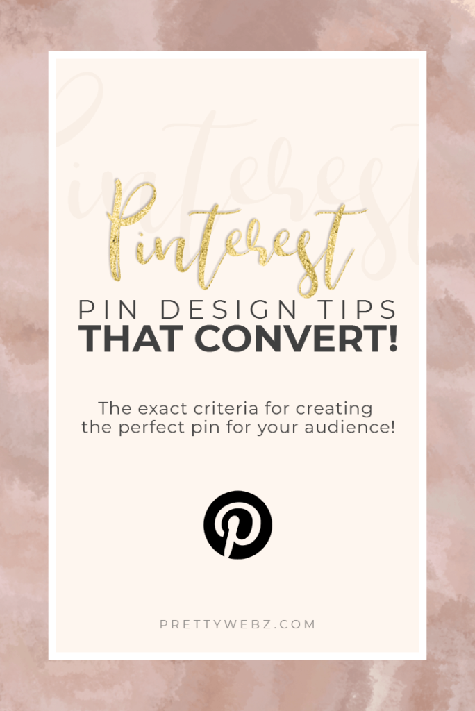
The Five Elements of a Pinterest Image that Converts
Why Pinterest Image Design is Important
Pinterest is increasingly becoming a go-to place for bloggers and marketers to promote everything from blog posts to product features. Pinterest image design is a big part of realizing success on the platform. Second to Google, Pinterest is my top traffic referrer to both my blog and shop so I’m sold on the power of the Pinterest platform. Just a couple of years ago Facebook was my number one priority. If you’re like most people marketing on Facebook, you know that the engagement on that platform has drastically changed.
Why Pinterest is Better than Facebook for Marketing
Facebook is a social platform. People go to Facebook for updates on friends and family. When they’re on Facebook their not in a buying mentality and that’s important. Pinterest, on the other hand, is all about aspiration. Mental aspiration via quotes and encouragement and interesting blog posts. Material aspiration via home decor, clothing and other products that will improve your quality of life. Pinterest is also a place for planning things like weddings, parties, and life in general. This is where people are in a buying mindset.
Maybe you don’t have a shop, odds are if you run a blog and rely on affiliate sales to survive, you still need the people who are in a buying mindset to get that affiliate sale. Pinterest is the perfect platform for getting those clicks.
More Posts on this Topic
Trading in Facebook
I have slowly begun to abandon my Facebook page and focus more on my Pinterest efforts. I still use Facebook groups for networking, but promotions and my Facebook page are all but dead.
To put this into perspective, I have around 14,000 Facebook fans that I put a lot of time and effort into acquiring. For me to say my page is dead is heartbreaking. Still, analytics don’t lie and mine is telling me that Pinterest is the place to be right now.
On Pinterest, I only have 6,500 followers. Even with a low number like this, I’m getting 200,000 plus people engaging with my content and a reach of almost 3 million. This kind of exposure is not uncommon on Pinterest. In fact, it’s very common to see accounts with small followings like mine get huge exposure because Pinterest isn’t about followers. Pinterest is about search and visuals, this is why your Pinterest image design is so important.
About the Viewer Metric
I know a lot of people will say this is a vanity metric and the number of people who see your pins doesn’t matter unless they click. That’s true. However, if more people see your pins then the opportunity to click is exponentially higher.
Since I started focusing on Pinterest I’ve tested several different types of pins. Some work and some don’t. There are a few things that make some pins more clickable than others. There are also specific design decisions that work best for creating pins that get shared.
Of course, there’s a lot more that goes into success with Pinterest than just the visual elements. I may explore that more in other upcoming posts. I want to start with visuals because Pinterest is a visual network.
The visual design of your pins should be at the top of the list. Both for getting people to pin your stuff and attracting traffic to your website. The image is a pinners’ first contact with you. You need to grab attention fast and in a good way.
In this post, I want to share with you my experience as a Pinterest user. What has worked in reference to pin design and where I’ve failed completely.
There are five elements that are essential to the perfect Pinterest image pin. If you focus on these five elements when making design decisions for your pins you will see results with Pinterest.
Pinterest Image Size – Go long, but not too long
I’m sure you already knew that Pinterest pins should be vertical, this is nothing new to you. However, a lot of people say square pins are acceptable on Pinterest. I don’t want you to waste your time with square images. They’re hard to read and don’t get re-pinned in most cases.
You may be the exception, that’s true. However, if you’re just starting out you probably want to see results faster. With so little time to spare, you’re better off sticking with what works.
Stick to these guidelines and experiment with square pins later on.
Ideal size 735×1102
Max size: 735x 2060
Anything between these two lengths is good for readability and avoiding getting cut off.
Having trouble filling all that space?
Here are a few easy formats you can use as a guideline:
Work in thirds – title (largest section), photo, branding (lower thirds)
Work in two sections – Extra large title, subtitle, (top two thirds) Photo (bottom)
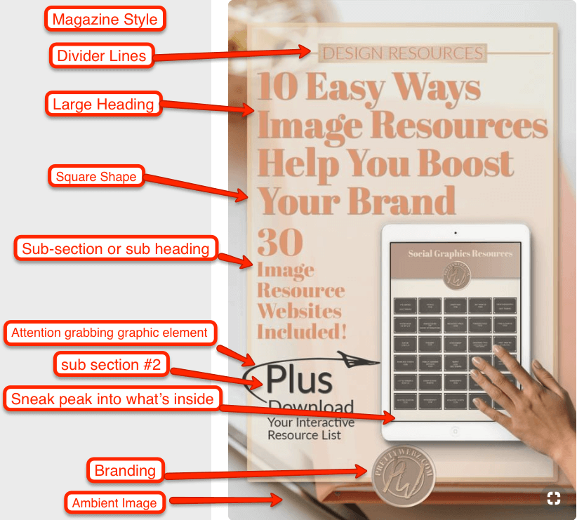
Magazine style – background image, main title, subsections, for example, featured content, freebie or bonus content available in the post.
The Most Important Part of Your Pinterest Image Design
On a Pinterest image text is always the focal element. Big, bold, clear, readable text. Here are a few ways you can use text in designing great Pinterest images.
- You can use a script text to accent or emphasize simple words but not for your entire primary message.
- Serifs and Sans Serifs in bold and heavy are best for your title and sub-titles. If you need some help pairing fonts here is a handy font pairing chart.
- Bold and bright color converts best and pastels do very well on Pinterest as well. Pink pastels are a pinner favorite.
- Vary the size of your font on specific words for emphasis and interest. If you want to emphasize a word, script fonts work well but use it sparingly and make sure the word is easy to read. You don’t want to defeat the purpose of the message for the sake of looking pretty.
- You can use color contrast to emphasize individual words or define sub-messages as well. However, use two or three colors max. Don’t overdo color or your overall image may begin to look choppy.
- Take a look at some magazine covers and mimic how they use images and text placement to pull together different ideas and subjects in one place. The magazine-style works very well on Pinterest.
Other Graphic Elements for Your Pinterest Image Design
There is so much you can do with images, backgrounds, design elements, icons, illustrations, and patterns. It’s important to remember that too much of a good thing can be bad.
Make sure not to overwhelm your text with all of the extras. Instead, use elements to define sections of your Pinterest image. If your text feels overwhelmed delete something, trust me.
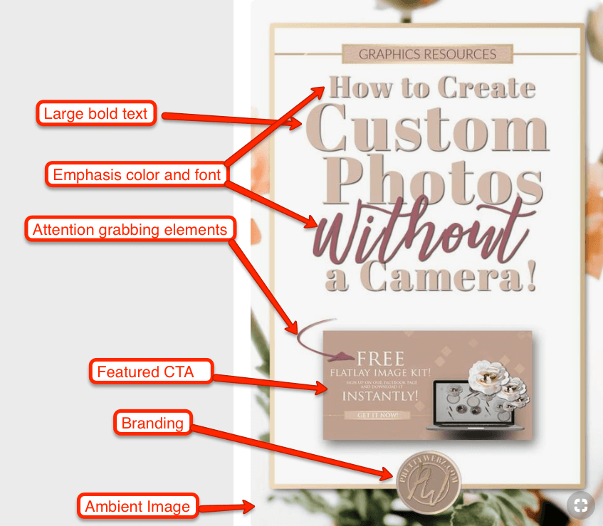
- Use shape layers to define a section, you can also add opacity to keep the division soft.
- Use arrows, stars, and other elements to call attention to specific parts of your Pinterest image but make sure these elements do not overwhelm the image. The key is balance and making sure that your title is the focal point.
- Lines, dividers and small elements can all be used to call attention and emphasize your message but should never be there if they don’t serve a purpose or if they take away from the message.
If something looks off about your image ask yourself if you actually need all the elements. If not, start removing them. Be brutal, it’s difficult to let go once you’ve committed to a design element, but it’s worth it.
I’ve been guilty of piling on design elements and messages because I want to get the point across. When I look back after the fact, I can’t believe I loaded so much into the design. You don’t see the faults in your design when you’re working so close to it. Create your design and then take some time away from it. Just as with writing, you have to look at it with fresh eyes.
I know from experience that it’s difficult to leave things out but always know your ultimate goal with this pin. Do you want to get them to your site? Get them to download your freebie? Read a blog post? Okay, you want them to do all of these things but you need to choose one action. If you overwhelm them, you run the risk of no action at all.
Using Images
You can get away with using a white or bright background when using other design elements like shapes. If you’re already using other design elements, you may not need images at all. Unless you’re featuring a product then use images of the product on display or in use.
However, if you want to use images that are not featuring a product review, product for sale or specific topics here are a few things to consider.
- Make sure the image does not take away from the text.
- Make sure that the image or images are related to the post subject.
- If you have an image that is neither of these but you still want to use it, set the image in the background as ambient photos.
What are Ambient Photos?
Ambient photos will include artistic and abstract shots, flat lay images of desktops or other items and stock images. Remember, as with text, bright and airy color is best with images.
Like a home, you want light, space and a beautiful ambient feeling.
Using Space
In design, space is vital. On Pinterest larger than life text is vital. So where is the median between overly large text and space? Normally you wouldn’t cover your canvas with over the top bold text. When it comes to text on Pinterest it seems that breaking this rule has worked in my favor and it’s expected.
Your message has to get seen. Organized sections with extremely large bold text do well. To clarify, your text should never be cluttered but definitely big.
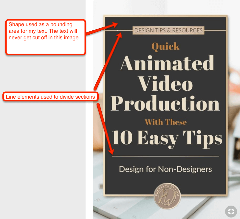
Make sure your text has a good margin. Text size needs to be big but not so big it reaches the edges of your image. The last thing you want is for your message to get cut off in the feed. Leave enough space so that your message is always clear but not cut off. I like to use a square shape as a border for my text. I know my message has to stay contained in that box.
Using space on a Pinterest pin can be a challenge because it can either get cluttered or look bare. Here are a few things to consider regarding space.
- As long as your text is big and bold all other elements should be secondary.
- Secondary design elements should have their own space on your canvas that compliments the text. If elements overtake attention from the text, remove it.
- Never squeeze elements onto the canvas, if it’s too much remove a section and use it to make a second pin using different colors, elements or images. By the way, the more pins you have for each post the better chances you have of them getting seen.
You don’t have to cram it all into one image. The most important thing to remember here is that the message has to be read clearly. Secondary text is important too but get the attention to make them click to get a closer look, then seal the deal with secondary text.
Grouping and Secondary Message
Make sure secondary messages are separate from your main title. You can do this by using smaller text size, color, separate space, etc. Use shapes, color, lines, and other design elements if you need to separate different aspect of your image even further.
Again, think magazine cover here. The background image, the main topic is large bold and readable from a distance and smaller subtopics are spaced out with smaller text groups. Once you have their attention they can “pick up” the pin or open it to see smaller subtopics covered in your posts like your free worksheet or your extra tips.
In Conclusion
That’s it, I know it seems like a lot but when you think about it, it comes down to having big, bold and readable text and designing around it. Pinterest is one of the best places online for promoting your online business and blog. To make creating your Pinterest pins even faster I urge you to create a few templates that you can use as a base or purchase templates from a professional designer on Creative Market. You can’t go wrong with professionally designed templates as long as you remember to keep that text readable!
There are so many factors to take into account when it comes to getting traffic from Pinterest such as Pinterest visual search, keyword, descriptions and even hashtags have become a thing in the past few months but if you’re going to start somewhere start with your visual elements and message. These are the things that are going to get people to stop and take notice.
Other Posts You Might Like
What’s Next?
I hope you enjoyed my take on what makes a good Pinterest image. Remember this is only one person’s experience. Take a look at the most pinned images on the platform to see what they have in common and you will find that these five elements are checked off the list for the most popular designs on Pinterest.
If you liked this post and want to get updates and more tips and ideas from me make sure to sign up to receive updates, freebies, resources and more from me by email. You can sign up in the footer of this page!
Did you like this post and want to save it for later or share it with a friend? Pin this image!