

Creative Brand Design – The Color Palette
Hello and welcome to another Prettywebz tutorial, in this post we’re going to discuss our first topic in the creative brand design series, creating color palettes. You can also watch the accompanying video for this post by scrolling to the bottom of this page.
Choosing color may seem insignificant but the colors you choose for your brand play an important role in the story you share with your customers and clients. Color can set the tone for how they relate to you and your products.
Telling Your Story With Color
You’re telling more than your own business story you’re also guiding your customers and clients through their own journey. Color is part of that story.
Your job is to inspire, there is a subconscious message you send by color choice and how you use color in your branding. Today I’m going to walk you through some resources from around the web and show you how to apply them to your branding to make sure your colors are evoking the right emotions and sending the message you intend.
Four-Step Process for Choosing Color
This process can be summed up in four steps as follows:
- Determine the emotions and story you want your colors to represent
- Choosing the best shade of your primary color once you have it
- You’ll choose accent colors based on your primary
- Make a color palette
Color Meaning
Your design should evoke a specific emotion from your readers.
- What do you want to say to them?
- How do you want them to feel when they come to your site?
Basic Color Theory
Get familiar with the basic color theory to choose colors for your website and branding. A few methods we review in the video are:
- Using the color wheel
- Color Harmony Formulas
- Color Context – how colors relate to each other
- Contrast changes our perception of a color
Color Saturation
This website starts with a group of colors and shows hue and saturation changes for all.
When to use:
Use this when you have no idea and nowhere to start with color to see various hue and saturation for multiple colors.
This website starts with a primary color and shows hue and saturation for specific colors.
When to use:
Use when you need more contrast with text or other objects or when you know the general color you want but need to pinpoint an exact primary color.
Color and User Experience
If you’re using a builder or a website theme that gives you a lot of freedom to choose and customize colors but you don’t know what color should go where try this simple UX guide. This website shows you how color can apply in a UX setting (website layout).
Choosing Accent Colors
Once you have a primary color, you can use Paletton to help you decide on secondary colors and also to choose accent colors based on your existing color palette. This website applies the methods of color choice found in basic color theory into a simple slider.
Recording color palettes
Once you have a color palette for your brand you can record it using a website like Canva or simply keep your color codes in a text document. However, I find it helpful to create a visual color palette and use a browser extension like Colorzilla to sample colors while you’re working. I may do a video on using your color palette that will include using extensions like Colorzilla in the future.
If you’re working in Photoshop, PowerPoint or Word you can insert the color palette and use the eyedropper tool to sample from your palette. I go over this in some of the web graphics tutorials as well so make sure to check those out. You can also watch more tutorial and tips videos about web and graphic design for bloggers and business owners here.
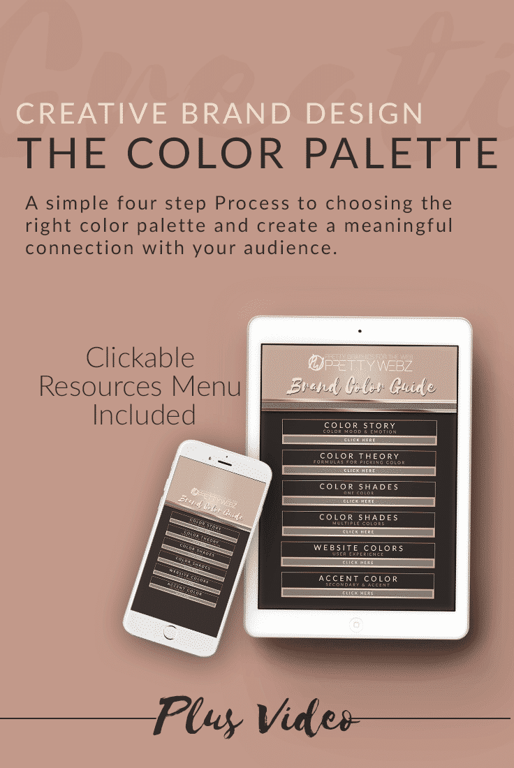
Download the Brand Color Guide Here
Some Other Things to Keep in Mind
- Choose your primary color most often.
- Use your accent colors on buttons, icons, lines.
- Your color palette won’t look good in every circumstance. In that case, use lighter or a darker shade of your color.
- Stay consistent, your color palette is your best friend.
- Black, white and grey can be used anywhere.
- Most important: readability if your primary focus if choosing between color and readability. Readability always comes first.
If you found this post helpful be on the lookout for more posts and videos in the Creative Brand Design series or sign up for our newsletter to get notifications whenever a new video, post or freebies are made available on the site.
You can also visit us on social media. We’d love to hear from you. Drop a link to your latest project on our Facebook page, it would make my day to see what you’re working on!