
Typography for Graphic Design & Branding
Typography for graphic design and branding is essential if you want to get your message across to the right people. Knowing how to position text with images is frustrating. All the elements are there but you can’t quite figure out why it doesn’t look right.
Working with typography in graphic design is fun. That is, it’s fun when you know what to do and how to work with layout and flow in your designs. Wouldn’t it be great to instinctively know what to do with your text when you look at an image?
It will come with practice. But if you want a good handle on this from the start, knowing a few general principles of design will give you a huge head start on your intuition. That’s what this post is all about. It’s not just learning about typography, it’s about learning how to use it with images and on its own to create amazing images without all the struggle.
What is typography for graphic design?
Typography is the use of fonts in the process of creating graphic designs, visual marketing assets, and branding assets. Typography uses hierarchy, spacing, font personality and layout to complement other elements in a design.
What is the role of Typography for graphic design?
The main role of typography for graphic design is to convey a message. There are different ways to achieve this task. Typography is not simple words over an image, it can be much more than that. Typography for graphic design, branding and web design does much more.
This important design element conveys a feeling. Typography frames your subject. In some cases, it is the subject and it sets the tone for your visuals. Typography is a unique part of graphic design, it’s arguably the most important aspect of your design.
More Posts on this Topic
What is good typography?
A font is just a font, even if it’s beautifully made and has crisp clean lines, it’s only a font. Good typography does a job. Specifically, it conveys a message in the clearest and most concise way. It provides a good user experience.
A well-designed font is not a direct comparison to good typography. A well-made font does not necessarily convey a message in the best possible way. It’s how that font is used that makes it good typography.
What is typography and its rules?
Typography doesn’t have rules, typography is an art. There are principles and guidelines you should follow when working with typography. These “rules” will help you guide people through your web design, and graphic design. All in a way that will be much more pleasant. In art, rules are meant to be broken. Learn the principles so that you know when they do and don’t apply.
Here I want to review a few font styles. Also, how to work with them to achieve the best possible experience for your users. I won’t go too deep into all the different aspects of typography. There is too much there to cover in a few minutes. I do want you to be familiar with the basic font styles and how to use them in your designs.
Major Font Styles
There are four major font styles. Each font style has several categories. I encourage you to study deeper into old methods of creating typefaces. Especially if you’re interested in why there’s a difference between a typeface and a font.
Are you curious about the difference between leading, line spacing, and line height? History makes all these things make much more sense. Still, it’s not directly important to your designs so we won’t focus on that here.
For now, I’ll give you the basics of font styles, line height, and hierarchy. We’ll even get into the difference between kerning and tracking. Let’s start with the four major font categories.
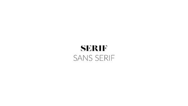
Serif
- Serif fonts have accented ends. This style is typical in fashion and traditional style designs
- Here are some words to describe design styles for which you might use serif fonts.
- Traditional
- Classic
- Well established
- Refinement
- Distinguished
- Serious
- Reliable
- Who might use a serif font? Here are a few ideas.
- Traditional fashion brands
- Men’s fashion
- Law Offices
- Typically, a business with a serious nature.
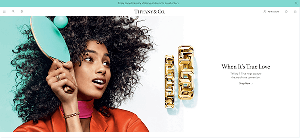
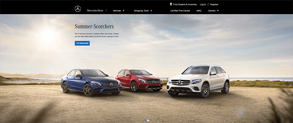
Tiffany’s and Mercedes are two iconic companies who use Serifs in their headings but also notice that they use sans serif for sub and body text. They are traditional but still concerned with readability.
Sans Serif
- Sans serif fonts have no accents, these are clean fonts with a modern style
- Here are some words to describe design styles you might use serif fonts.
- Sleek
- Simplified
- Minimalistic
- Cutting edge
- Forward-thinking
- Who might use a Sans serif font? Here are a few ideas.
- Tech
- Modern fashion
- e-commerce
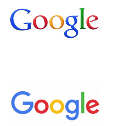
Amazon, Apple, Google all use sans serif fonts in their branding. Google is a perfect example of replacing the old feel in their old serif logo for a new sleek sans serif font.
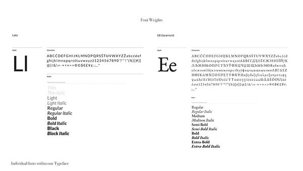
These are the two major font categories for marketing design. There are several categories within these major categories. There are also script and display fonts which we’ll discuss next. You should put most of your focus on Serif and Sans Serif fonts. These two categories are the easiest to read and will give you the best user experience.
You want to make sure that your message is clear and people are able to understand it. Stick to one of these two categories for marketing design, logos, and advertisements. Even though these fonts may feel basic, they are far from it. In fact, serifs and san serifs have the most options when it comes to variation in weights.
Font weight will give you much more flexibility in your design choices and will help you create balance. Okay, with that said, let’s move on to the last two categories.
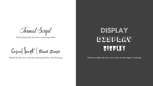
Display fonts
- Display fonts are decorative fonts and they have an artistic quality to them. These attention grabbers may be serif, sans serif, or script. However, Thes fonts belong in their own category. These fonts cannot be used in the same way you use traditional fonts.
- You will typically see display fonts in large format. Things like bold titles, art pieces, posters, and the focal point of a marketing design piece.
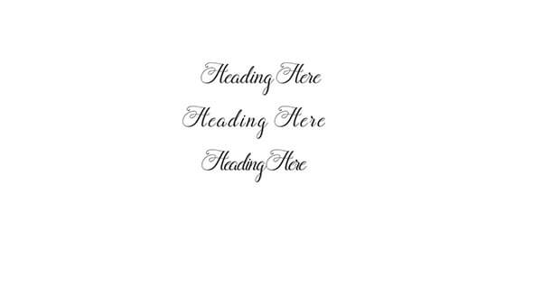
Script Fonts
- Scripts are by far the most popular of all the font categories. These fonts have beautiful lines and curves that are very attractive.
- You have to be very careful with script fonts. Too much can make text unreadable and overwhelm the design. Because of difficulties with readability, script fonts don’t work in marketing design on their own.
- Use a script to call attention to one or two words or for decorative purposes.
- For blogs and web design. Do not use script fonts for headings, titles or body text. Your design will look good but if your audience can’t read it, it’s pointless.
- For the best user experience avoid script on a blog, web design and in marketing design. Unless it will be used to accent a word or as a design element. Save script fonts for social media quotes and accents.
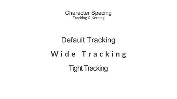
Character Spacing
- Default spacing – This is the spacing before any manual adjustments
- Wide spacing – roomy, luxury, drama
- Tight spacing – Bold, loud it almost feels as if it’s overcrowding you. Where wide spacing gives relief, tight spacing builds tension.
Font styles and spacing
- Lower case fonts don’t look good with too much spacing. Spacing, in this case, looks like jumbled letters.
- All caps look good with increased spacing because space reduces the impact and gives you some relief.
- Script fonts never look good with wide or tight spacing because of the way the letters are meant to interact. Designers create script fonts with specific space in mind. Too far and you lose the flow of the letters. Too tight and the lines start to cross in an unappealing way.
Kerning, Tracking
- Kerning – space between individual letters in a word
- Tracking – Uniform spacing between letters in a word
If you’re using a program like Photoshop, it only uses tracking. You have to manually select the letters for which you want to change kerning.
Leading (Line spacing, line height)
- Leading – space between lines of text
- Typically, between 120% and 200% (double spaced)
- Calculate line spacing by multiplying the percentage by the font size. For example, if the font is 18 point and you want the line spacing of 150% or 1.5, you would multiply 18×1.5 = 27. Keep multiplying by the line spacing you want. These calculations will give you sizes for body text, subtext, and headings. You can also calculate title font sizes and their respective spacing with this.
- If you’re not into math there are tons of websites that will calculate leading for you. Type Scale is a good one, that gives you several options, including the popular golden circle calculations a lot of designers love to use.
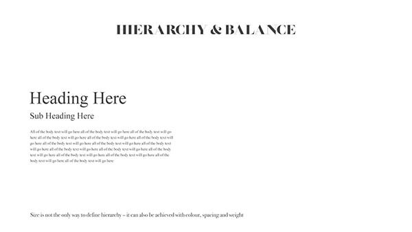
Hierarchy and Balance
- Figure out line-spacing and point size for your fonts first. Then you can assign proper sizes for titles, headings, subheading, body text, subtext.
- Achieving a good hierarchy happens when you set these numbers in advance and stick to them.
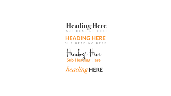
- Hierarchy by size
- Hierarchy and balance using color, spacing, case, and weight.
- Case
- Lower case – soft, gentle
- Upper case – strong, loud
- Weight
- Bold – loud, strong
- Light – Softer
- Italics – Use italics for accent and to call attention to something. You can also use italics for emphasis. Similar to the way you use script fonts but you can use italics for entire lines of text.
- Use thicker and thinner font alternatives for balance
- Use color for balance or as a design touch to words in one heading. Do not use color for Hierarchy, always use size, weight, and case.
- Case
What is body type in Typography?
Headings and subheadings help you describe what will be explained in the body type.
Body type in typography for graphic design and in general is a part of the type hierarchy. Body type is the largest portion of type in your design, it’s where the details go.
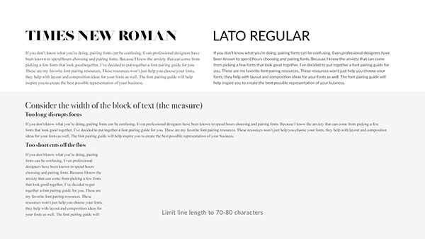
Typography for Graphic Design Layout Examples
Here I want to give you a few tips on using your images to determine text placement. We’ll also look at using typography as the focus of your design. You will begin to see how your image dictates placement and how one focus can help layout flow much more easily.
Typography with images
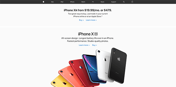
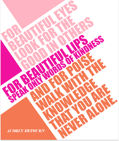
If there is an image the text is laid out to complement the image subject. This is true most of the time but remember, good design is about breaking rules. If your layout works but doesn’t follow this “rule” go with it.
There are three ways typography will engage with your images. The text follows the subject, aligns with it, or interacts with it.
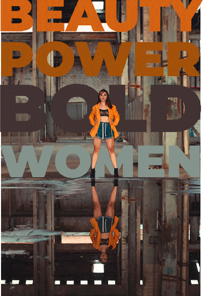
Text Interacts with the Image Focus 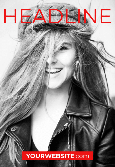
Text center aligned with the image focus 
Text vertically aligned with image focus
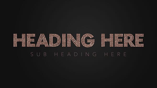
Typography for Graphic Design with text and no photos
Typography can be the centerpiece of your design without images. Use fonts with unique styles, color, shapes and interesting layouts to create a design that stands on its own.

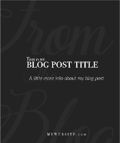
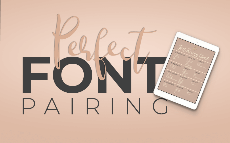
Fonts can have a lot of impact when you use italics, layering fonts, opacity, and proper font pairings.
Base your font choices on the feeling you want to convey with your design. Fonts, just like colors and images have personality. We discussed a few of these in the first section on font styles. Explore font personalities and choose them based on how you want your audience to feel. Do you want luxury, whimsey, traditional? Keep your overall branding in mind when making font choices as well.
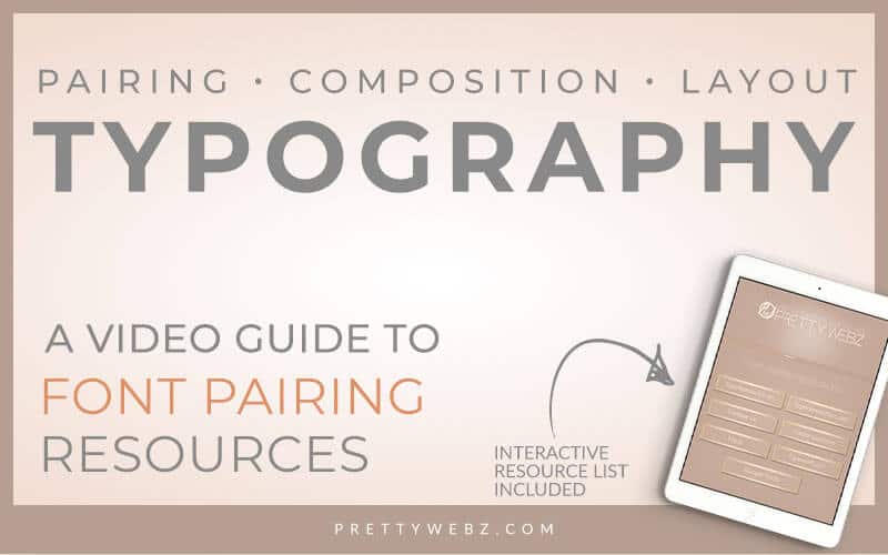
Typography Layout Inspiration
Do you need some inspiration for your typography layouts? Watch this video where I walk you through some of my favorite websites for typography layout inspiration. I browse these whenever I’m feeling stuck on a design.
Why is typography so important in graphic design?
Branding and marketing depend on graphic design. The role of graphic design is to deliver an image and message to a brand’s ideal clients.
The ultimate goal is to sell products and services via a website, ads and other printed materials. Typography is a large part of getting that message across in the most effective way possible. Are your ideal customers getting the message?
If you get anything from this post I want it to be the importance of typography in design. Keep your ultimate branding and marketing goals in mind as you read through this list.
Five reasons typography is important
- Creates balance in your design. Good user experience creates happy customers.
- Sets a tone for the image. Fonts have personalities. Choose fonts to convey a feeling with choice typography. The words and the feeling create a mental and emotional message.
- Visual cues to the most important take away from your designs. Are you effectively conveying the overall message or action you want clients to take?
- Helps you draw attention to specific areas of text. This is what you want your customers to hear the most.
- It is your message. No one knows what you’re saying unless you say it.
Other Posts You Might Like
What Next?
If you like the informational posts and videos that we share here on Prettywebz, then make sure to subscribe to our newsletter to receive a notification every single time we send out a new video or a blog post. You can sign up in the footer of any page on the website.
Also join me on Youtube as well to check out the playlists I’ve set up for Photoshop, PowerPoint and other software you can use to design your online graphics.
Did you like this post? Share it with a friend or save it for later by pinning this image!