
4 Principles of Design Unity: Secrets to the Best Graphics
Principles of Design Made Simple
Principles of design unity are elements of design that create an overall uniform feel to your graphics. It’s essential for non-designers who create graphics for promotions, blogs, and social media to understand the basic principles of design unity for better designs that speak to your primary audience. In principles of design, unity is a group of elements that give your design a sense of balance and organization. Understanding the elements of unity will also help you design faster and with better quality.
The Importance of Unity in Design
Having the ability to rise above the rest is a big deal, and people spend a lot of money studying the perfect image, the ideal color, and the ideal message. From size to text and picture composition, we’ve gone A/B testing crazy. If you’re DIYing your graphics, please stop! At least long enough to take a little time to learn some basics about design concepts.
Make sure everything you put out looks appealing to your target reader. Understanding design harmony and contrast is one secret weapon that all graphic designers have in their arsenal to ensure their designs are stunning and technically perfect.
I use the word “technically” here because you also have to work on your message and select the right images for your specific audience. I’m sure you’ve already figured that one out if you’ve read anything else on this blog.
The Benefits of Understanding Unity in Design
- You want to save time while designing
- If you want your designs to look more professional and stand out from the rest
- You want to attract more attention to your business through your visuals
You’re not a designer, and you don’t want to learn to be one, I get it. With that said, odds are you design blog images, product images, social media image, and the list goes on, right? Online business owners, marketers, and bloggers spend thousands of hours perfecting their visual content to stand out from the rest.
It makes sense that you would also want to reduce the time you spend making graphics while at the same time making images that stand out. You can do this by learning a few basic principles of design unity and applying these principles to your work. Learning these basics will keep you one step ahead.
Alright, that was my quick explanation on why I’m talking about Principles of design unity to non-designers.
The Basic Elements of Unity in Design
These basic elements are the principles of design unity:
- Contrast
- Alignment
- Space
- Repetition
Principles of Design Unity: Contrast
Contrast is the use of opposites to create visual interest and draw attention to specific aspects of your design. When used strategically, contrast is the thing that makes your text pop off the page. Contrast is especially important for a blog, promotional and social media image. These images typically use a lot of text.
Learning about contrast is an essential part of working with text. Giving your fonts some contrast ensures that your message is clear and stands out on a contrasting background.
Ways to Create Contrast
- You can achieve contrast with colors, like black and white.
- Contrasting patterns also work well, such as stripes and dots.
- Size is another way to use contrast, for example using one large object among many small objects creates focus on the dominating object through the size contrast.
- You can also create contrast using opposite font pairings. For example, pairing a Serif with a Sans Serif or a script with a sans. The key here is not going too far by using too many fonts. Two fonts or three at most creates the best effect. If there are too many competing fonts on the piece, then it’s difficult to tell where the eye should go first. You will fail to create a hierarchy with your text and run the risk of confusing the reader. Using less competing elements will create a nice contrast.
Takeaways for Contrast in Text
- Background and text color variations can add contrast and emphasize text
- Use size variations in your typography to contrast and highlight essential words and phrases in your message
- You can use opposite complimentary fonts to create hierarchy and contrast for headings, subheadings, and paragraph text.
Principles of Design Unity: Space
This one thing is so simple and obvious, yet the majority of business owners who create their graphics for the web don’t think about it enough. Marketers and bloggers want the message to be as big and bold as possible to maximize attention, so they sacrifice space. In turn, their graphics are well, not quite right. Take a look at this example to see what I mean.
Have you ever seen a Pinterest image or a blog feature image where the text butts up against the edge of the design, like this?
Did this look a little off to you? Maybe a bit distracting? You may not have noticed it consciously before I brought it to your attention. We subconsciously see things like alignment, size and space usage in images without even knowing it. If our readers are distracted by the little things, even subconsciously, those little distractions are taking away from the message we’re trying to put out. Do you want a big bold message or an effective one?
Bigger is Not Always Better
On Pinterest, the rule for text is “the bigger, the better,” I get it. We love reading all the latest and greatest rules and tactics for getting attention, I read them too. I’ve been tempted to go big, basically screaming my message because it does attract attention, but it’s difficult to trust. The giant overpowering text reminds me of a used car commercial. The ones where you get the feeling your wheels will fall off the minute you sign on the dotted line, not the nice “pre-owned” ones.
I showed you the images above in particular because I had a lot of trouble getting this to work for me. It goes to show that even simple graphics with only a few objects can be challenging. However, understanding that your design elements need room to breath will help.
Principles of Design Unity: Alignment
Alignment aids in balance and proximity, two essential principles of design unity. Making sure your graphics elements are aligned will create a sense of cohesion within your design. In other words, every aspect of your design needs to align with something else.
Alignment leads your reader through your design
Why does this matter? Well, if you want your reader to feel at ease when reading your copy, you need to provide a clear and visual way for them to get through it. Without throwing in the distraction of elements that feel like they don’t belong. Misalignment creates an interruption in our subconscious, and we don’t like that.
Alignment Paths
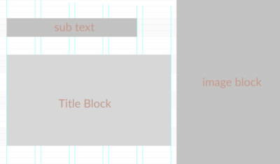
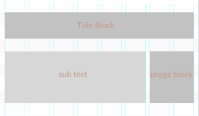
We typically define alignment as rows and columns, but there are a large variety of alignment types. Rows, columns and center lines are the most common ways to align text and objects in a design. The best way to ensure that you don’t struggle with alignment is to always use a grid to layout your design.
You can make a grid template for each of your design sizes. For example, prepare a grid for different platform social images, blog images, and ads. This way you always have it available to you when you need it.
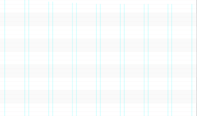
Download These Grids
Click here to get a PNG version of this file. This grid can be placed over or under any design to be used for reference and then deleted when you have a layout that makes you happy. You may also want to create your own so that you have a grid is sized correctly for the sizes you use.
![]()
If you have access to Photoshop, The Grid System is a useful resource for downloadable grids.
Why go through all the trouble?
Spend a few minutes up front to make a grid for your designs, and you will save hours of frustration later. The example images from my blog that I’ve shown you in this post could have taken minutes.
I didn’t use the grid, and it cost me a lot of time, frustration and an unflattering layout. Creating a grid template for your work does take some time in the beginning, but it pays off in the end.
How much time do you spend analyzing your headlines, choosing keywords, action words and researching how to make an impact? I’m guessing it’s a lot. Of course, you do. It’s your business.
The thing is, you spend so much time crafting the perfect message and then give up when it comes to the small details in the visuals that can subconsciously create doubt in the mind of your reader. It’s your business. Your livelihood depends on more than just subpar graphics. You need to get your message out clearly and without distractions.
Repetition & Pattern

Pattern and repetition lend well to brand identity and can help people get to know and trust a brand, this is a sign of consistency.
When the objects and colors in your design look alike our brains naturally associate them with one another. Using repetition in your designs creates aesthetic consistency. You can achieve this by using patterns and repeating themed objects.
It’s common for branding boards to include patterns, colors, and typography that is used to create unity on a larger scale. Repetition and pattern are also very powerful on a small scale within individual graphics.
Maintaining a professional online business
I will be the first to admit that things will go wrong with your blog, your website and your social network images too. However, we all strive to be the best we can be. Being the best at what we do means we have to pay attention to the smallest details to stand out in a sea of online entrepreneurs.
Alignment in your design makes a more aesthetically pleasing visual that your readers will gravitate. In addition to initial attraction, a well-aligned design serves another purpose. That is, it makes it easier for the eye to find balance and proximity. In turn, creating the image takes less thought and is easier to get through establishing a better user experience.
It’s all in the Details
I know these principles of design unity may seem small, but if you’re at a point in your blogging where you can fine-tune your strategy, the details will set you apart from the herd. We can all use a leg up. Whether it’s color, typography or something like alignment which is difficult for most to pinpoint but they sense it, trust me.
Social network images are essential for your messaging. Therefore, you need to consider everything, including the aesthetics of your images. As professionals in the online world, we can’t afford to take even small things for granted.
What’s Next?
If you found this post helpful be on the lookout for more posts and videos in the Creative Brand Design series. Need some design inspiration? Check out our themed graphics roundups that include free for commercial use images, fonts, and clipart that are perfect for social, blog and promotional graphics. Here are the most recent:
We love talking about branding and design, but I’m also passionate about business and planning. I design graphics freebies and business planners for the users of this blog too! Don’t forget to check out all the free downloadable resources available throughout the blog.
In the PrettyWebz shop, you can get freebies like social media overlays, blog headers, social media icons and themed digital papers and many other free and premium graphics. Visit the PrettyWebz shop to check them out.
Get more free graphics by signing up for the PrettyWebz newsletter down in the footer and never miss out on a freebie again!
Every resource we offer on the blog and in the shop is put together in a convenient package for you and deliver to your inbox every single month!
If you like this post pin it so you can reference it later!