

Watercolor Textures Designs
Creating and Using Watercolor Textures in Graphic Design
In today’s post, you will learn a few different ways to use watercolor textures in your designs. Plus, products that will help you make the design process a whole lot easier too.
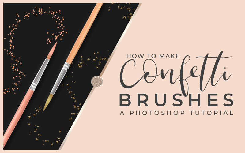
I’m also going to take it one step further by showing you how to make your own watercolor brushes in Photoshop in the quick tutorial below. Make sure to read the three secrets to achieving a realistic watercolor texture brush before you make yours.
Use these brushes to create beautiful imagery, design accents, web graphics and so much more. You can watch the video here or skip ahead to get some amazing design ideas and products to help you design more efficiently.
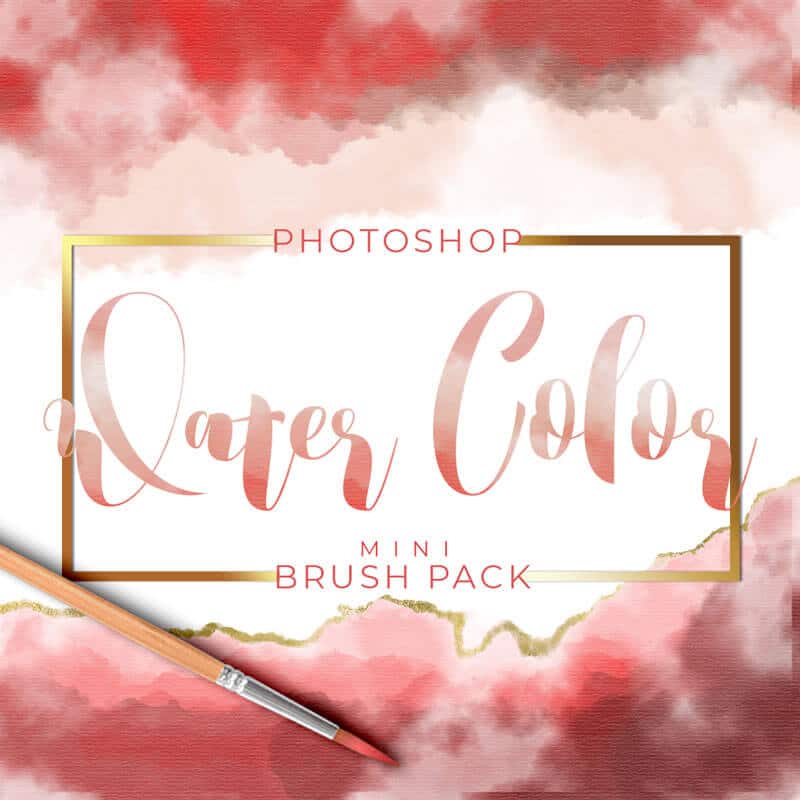
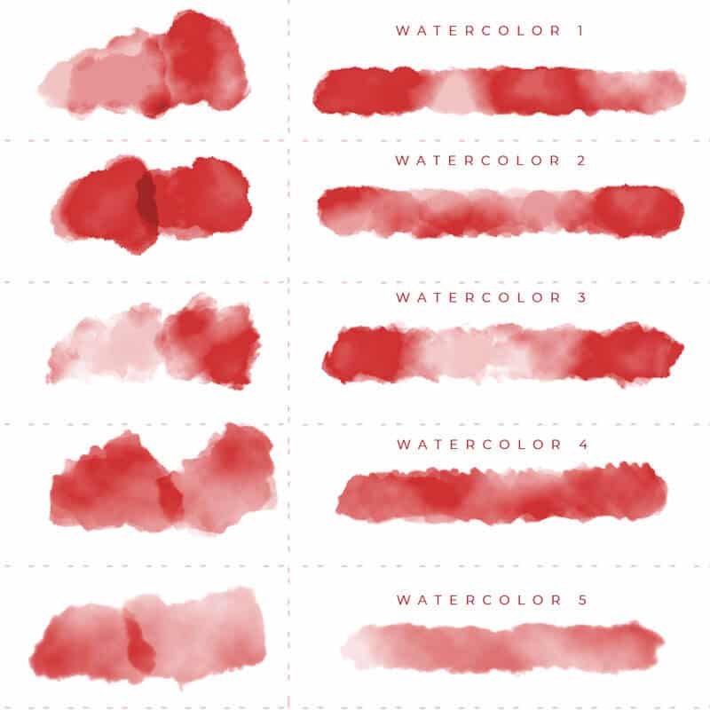
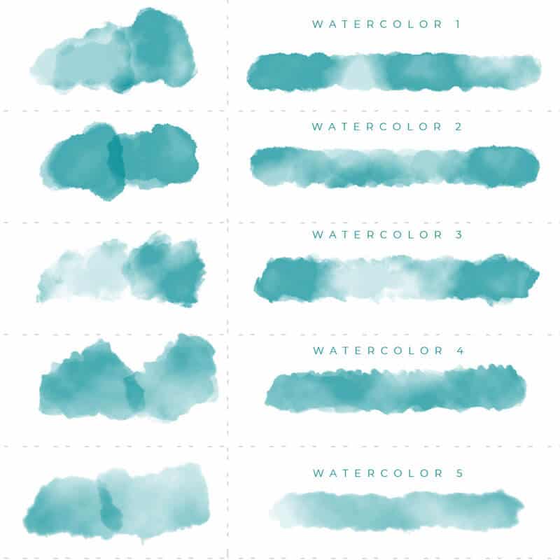
BONUS! Get Five Free Watercolor Brushes for Photoshop!
Three Secrets to Achieving a Realistic Watercolor Texture Brush
Watercolor textures have a very distinct look and feel to them. I will be teaching you how to make a watercolor brush in this weeks featured video. Therefore, I think it’s important to understand Watercolor. More specifically, you need to know how watercolor paint flows and also the consistency of the paint. Understanding watercolor will help you make a more realistic brush effect in Photoshop.
First and most importantly, your paint strokes have to look “watery.“ Watercolor paint bleeds onto the canvas. The bleed is the most common characteristics of watercolor.
1. Watercolor Texture Bleeding
When watercolor is placed on paper or over another wet watercolor, the texture is watery. Because of the watery texture, the paint bleeds onto the paper. The specific way watercolors interact with the paper and how paint colors interact together is very specific. All of this is important in a watercolor texture brush.
2. Watercolor Transparency
The transparency of a watercolor texture is an important factor for making custom watercolor brushes. The transparent effect should be present in stroke overlaps and where the strokes and colors bleed together. You should also see this where the strokes interact with the background texture.
Water is transparent. The more water, the more transparent the image will be. Even if you prefer thick watercolor, the transparency will still be there. The water creates some transparency between the canvas and the layers of paint.
Watercolor textures have to look diluted, fluid and, well, watery.
3. Saturation
Because you’re mixing paint with water, there will be slight or dramatic variations in the saturation of the color as you paint it onto the canvas. This variation in saturation will give you a cloudy or faded effect in some areas and very saturated, bright colors in other areas. Painting with watercolor gives you some very unpredictable and therefore, unique textures. Watercolor textures add a lot of interest and depth to your design.
Other Posts You Might Like

Coloring Outside the Lines
The characteristic that makes the watercolor texture so beautiful is the idea that it is fluid and unrestricted. Watercolor is perfectly imperfect. This sort of art medium speaks to people at an emotional level. The flowing nature of watercolor makes it easy to draw and create without having to be perfect.
It’s okay if you color outside the lines, that’s how it’s meant to look. If you’re not a natural artist watercolor is very forgiving of imperfections. I do not consider myself an artist by any means but, even I can draw simple flowers and flowing abstract watercolor textures with the best of them.
Nine Ways to use Watercolor Textures in Your Designs
1. Backgrounds
The great thing about using watercolor textures in your background is the versatility of watercolor. This is going to be true for all of the ways that you can use watercolor. Specifically for backgrounds because it’s such a large part of your design.
Watercolor can be extremely dramatic or, very subtle. In that respect, the watercolor texture will give you a high versatility for how you can use it and it will be appropriate in so many different applications because of this.
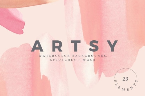
I adore this set of watercolor backgrounds and elements By Basia Stryjecka. These are all hand painted, watercolor backgrounds and watercolor splotches. Perfect for print and web projects such as wedding invitations, branding, greeting cards, and many other uses. This kit comes with ten watercolor backgrounds, twelve splotches, and one watercolor wash.
2. Mixed Media Textures
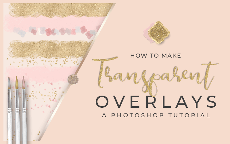
I love using watercolors as an element in overlaid textures. The contrast of the subtle beauty of the watercolor texture complimented by stronger textures like metallics creates a striking effect.
Take a look at this mixed watercolor textures from Belliaroze. These gorgeous watercolor textures command so much more attention with the watercolor and metallics mix.
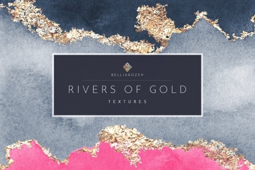
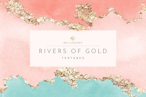
Want to learn how to do this on your own? Watch my watercolor mixed media video for a step by step on achieving this gold and watercolor mixed media effect.
3. Web design assets, headers, dividers, buttons
Watercolor design for websites is perfect for handmade business, artistic subject, and creative topics. I also love the concept of watercolor design for nature and holistic style websites as well.
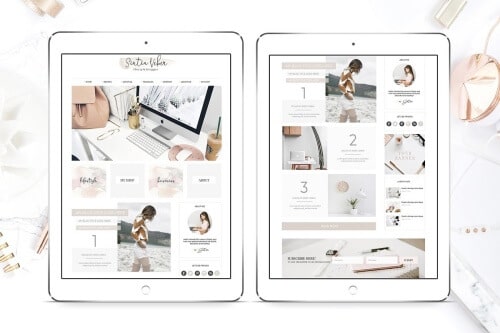
This web graphics kit from Switzergirl is a great example of using watercolor textures in blog labels, social icons, and buttons.

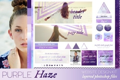
Another great example of watercolor textures in web design is this blog kit by Coral Antler Creative called Purple Haze. Notice the feature iamge overlays, buttons and beautiful watercolor accents.
Some other web design ideas to consider are general paint strokes to accent headers, subtle accents on the background and adding dimension as a foreground parallax effect as well.
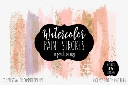
Brush strokes like this one from Clipart Brat Graphics are perfect for subtle hints and accents on a website and you can also use them as labels or buttons.
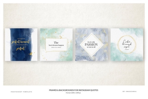
4. Accents for social quotes, frames and borders
Watercolor design is great for social media images in general but specifically for inspirational quotes. You can also use watercolor wherever you want your words to have an emotional effect on the viewer. I think watercolor is a perfect element for stirring emotion. Water has always been associated with strong and subconscious emotion.
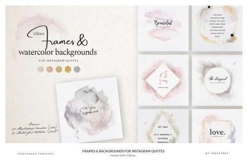
Take a look at this stunning done for you set of quote and text frames featuring watercolor textures.
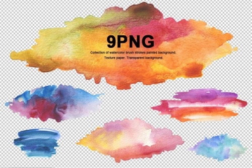
Another idea for social media graphics is using general watercolor texture strokes to accent social media graphics and photos. These transparent PNG watercolor textures strokes from Liliia Rudchenko are perfect for the job.
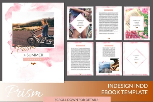
5. Opt-ins, Worksheets, Checklists and Ebooks
Watercolor is a great way to accent worksheets and documents designed for mental thought and action. Most work presented in a worksheet or checklist is action driven. Watercolor design can bring a calm feeling to the work ahead. Graphic elements for a product meant for action is never the primary focus. Even though the design is not the center of attention, the design may help the users interaction with the work. Think about it, business planning, personal planning, brainstorming, and other mental work can benefit from a watercolor design.
This ebook template for InDesign is a great example of using watercolor textures in workbooks, ebooks, and other text-heavy documents.
6. Digital (or print) Thank you and Christmas cards to clients
Okay, I stake my claim that watercolor is an emotional and all in your feelings style. At least to me, it is. Water is emotion, watercolor represents that. That’s why it’s great for thank you cards and design with sincere sentiments behind them.
Need some watercolor textures, patterns, and elements to make the perfect custom design? This bundle has it all! Illustrations, Textures, Patterns, Digital Papers, Wreaths, Frames, Logos, and much more.


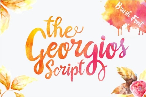
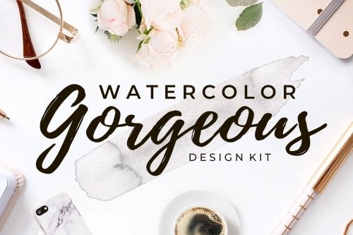
7. Fonts and Typography
Give your displays and headings the wow factor by adding a watercolor texture. Watercolor looks stunning inside of text. This works best with chunky, whimsical font styles but that’s not always true. I love the contrast of using the soft feel of watercolor with a hard sans serif or bold display font as well.
Here are a few fonts that will look like they were made for a watercolor texture effect.


What is a watercolor font without the watercolor texture, right? Don’t worry, I found an amazing watercolor text effects kit. These photoshop styles and patterns were made specifically for creating watercolor text effects. Check out this text style kit to dress up your fonts with amazing watercolor textures.
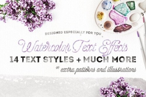
Get your super useful watercolor text styles and it comes with some extra Christmas-themed goodies! Decorate your own designs with soft, pastel watercolors. Perfect to use for websites, any digital media, invites, business cards, flyers, posters and so much more.
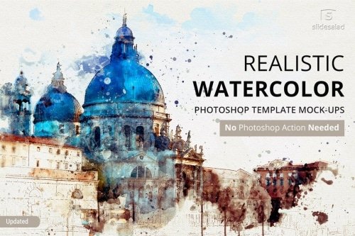
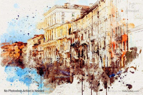
8. Feature & Blog Images
Take a boring stock image and make it uniquely yours by turning it into a watercolor. What a stunning and dramatic way to portray pictures people have seen countless times before. Travel photos look especially beautiful as a watercolor textures because travel is a dreamy and emotional thing for most people. They’ve seen photos of the Eiffel tower a million times before. Why not give them the iconic photo of the Eiffel tower in a dreamy watercolor.
Think creating watercolor sketches of iconic places will take up all of your time? Take a look at this watercolor texture template from Slidsalad. With this resource, you could create this look in just a few minutes.
Watercolor Creator by Vintage Voyage is another PSD setup that works beautifully for creating watercolor textures on your photos:

This awesome pack will help you to convert your photos into creative watercolor painting with just a few clicks! Tons of creative templates, effects, brushes, and masks. All of these beautiful watercolor effects are easy to use and are well-organized in PSD files. This kit includes 15 main watercolor painting effects, color correction layers, and 502 artistic brushes.

9. Brand Assets
Watercolor design is very popular in branding and looks soft and subtle in logo design. It accents text perfectly as it does not overpower the name. using watercolor in your branding is a great way to add visual interest and a handmade feel to your brand.
This brand kit from Switzergirl is a stunning representation of how to use watercolor in logo design and branded assets.

What Next?
If you like the informational videos that we share here on Prettywebz, then make sure to subscribe to our newsletter. Subscribers get more than just blog post notifications, you get freebies that are exclusive to the list. That’s right, you won’t see any of the resources shared with my email list anywhere on this blog. I don’t want you to miss out so subscribe today! You can sign up in the footer of any page on the website.
Also, join me on Youtube to check out the playlists I’ve set up for Photoshop, PowerPoint and other software you can use to design your online graphics.
Other Posts You Might Like
Did you like this post? Share it with a friend or save it for later by pinning this image!
