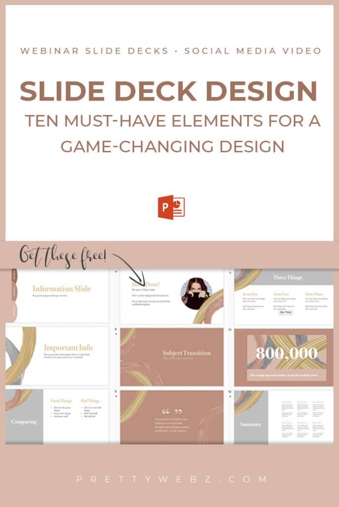

Slide Deck Design: 9 must-have elements


Slide deck design
Slide deck design is a powerful tool for marketing that is typically underestimated in how impactful it can be to what your audience does next. A well-designed slide deck can change everything. Visuals can shift the mood from so-so to dynamic and exciting.
An effective slide deck has all the right information in the proper amounts and has just the right pacing to keep everyone engaged and excited about your content. The content will do the heavy lifting here but the pacing and user experience can make or break your presentation just as easily.
1. Clarity and Focus
Design is meant to clarify and enhance your focus not take over as the centerpiece of your presentation. Use simple, elegant graphics that enhance who you are as a company, branding, or the product itself if there is one.
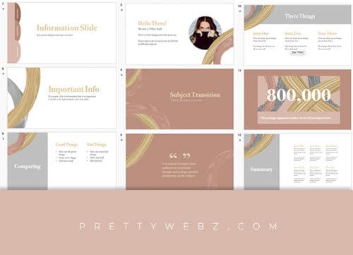
This slide design uses minimal square elements to make a visual impact without overwhelming the slide deck design. See more images of this slide deck design on Creative Market.
2. Tell a Story
Do not spit information and statistics, no one wants to hear just the facts. It’s easy to drop a lot of impressive statistics and beautiful charts in a presentation. I know you want to impress the person you’re pitching but you need a context that goes deeper than simple numbers.
We make decisions with our head and our hearts. How many times have you made a decision based on a gut feeling? In general, telling your brand story consists of four parts. The first is stating the problem. The idea is to bring up the emotional tension they feel when they are experiencing this problem. The second part of the story is your product or offer. Give the audience the experience of your product as the solution to the stated problem. Take this further by demonstrating, through the story, why your company is the best vehicle for delivering the result or solution.
Just like your favorite author builds tension and makes you care about something before they drop all the good stuff. You have to paint a picture of just how bad it is. Let them experience how bad it could get, and then give them all the good stuff.
Pacing Examples for Story Telling
Pacing example: three tension slides, one solution slide
- Slide one – Problem: What problem is your audience facing?
- Slide two – Cause: What is the underlying cause of that problem?
- Slide three – Effect: How much is this costing them?
- Slide four – Solution: What are you suggesting to fix the problem?
3. Restrict the Reading
Resist the temptation to use too many words on your slides. Audiences have short attention spans. We can only pay attention to one thing at a time. Multitasking is a myth, if you’ve studied anything about productivity then you know that this is true.
Slide decks are a tool for enhancing your ideas not delivering them. If you plaster your slides with your speech, word for word then they are either going to listen to you or read your slide decks. I’m betting you want them to listen to you.
4. Keep Consistent Visuals
Pick a color palette and stick to it
Before you begin to design have a consistent color palette, fonts that will be used and all graphics elements decided. Be clear on primary colors used for text, headings, and calls to action (attention grabbers). Use these colors on every slide. Do not introduce odd colors, graphics or imagery. Random design elements will command too much attention and may have a negative effect on the audience.
The exception to this are those instances when you want to create negative emotion with the audience or you want to call specific attention to something. Unless inducing an uneasy feeling with color or imagery is the intended effect, stay consistent. If you use a random color to draw attention, do it only once or it will lose its effect and it will look bad.
Use a mood board to help you create a theme for your slide deck design, watch the video below and download a free mood board template here.
Typography
Use no more than two fonts, one consistent heading, subheading and text font use the same colors, weight, size for each font consistently. If you need help with font pairing, I wrote this post that will help you make the right choice for your slide deck design. Make sure to pick up the font pairing guide as well!
If you need some inspiration for layout and composition or font choices from great designers to get some great resources in this post I wrote, I also made a video. You can watch that below.
Use Images with Purpose

Photos, we are visual creatures, a picture is worth a thousand words and all the other sayings about visuals can be inserted here. But remember, we can only focus on one thing at a time. Photos need to create an emotional impact, even if it’s small or it needs to go.
Use only one photo on each slide deck whenever possible. Simple, clean focus. If you’re going for negative emotion then plaster all that negative energy on the screen to get your point across but this is the only exception. Make the negative story jarring and when they see the solution, your product, it will be a relief from the stress.
If you must use stock photos read this post I wrote for some ideas on using stock photos in creative ways.
5. Contrast
Make sure you have good Contrast. The text must be clear and legible from a distance. Achieve clear text by creating enough contrast between the text and the background. Alternatively, you can use the contrast between the background and the text to grab attention. Using strong contrast in key moments of your presentation will help people pay closer attention to these key moments.
Do not put text over images without providing some contrast via a shape underlay or accent. You might also think about reducing the opacity of the image. Make sure you don’t overwhelm your audience adding photos with text overlays and graphics. If not done properly this group of design elements can go wrong very fast.
6. White Space
White space is just another way of saying give your slide deck design some room to “breath” give the elements like fonts and graphics elements space. Icons and graphics should be minimal. You don’t need a lot to make a big impact. A few select graphics used to draw attention to your focus is all you need.
7. Use the Rule of Thirds
Design using the rule of thirds by dividing the slide into three equal sections. You can do this with the grid tool in PowerPoint or just eyeball more or less where those dividing lines should be. The closer you follow the guides the better but it doesn’t have to be surgical.
Don’t get too caught up in this, here are a few examples you’ve seen a million times. Three icons with text evenly spread on the slide. An image in one third and text on two thirds.
I follow the rule of thirds in this slide deck design. You can download it free if you want to take a look at it. While you’ve got the slides up, take a look at the animations used for this deck. I made the slide deck design for a video I recorded on PowerPoint animation. Download the slides here and then watch the video below.
8. Use Animations Intentionally
- Be selective – too many animations are distracting Animations have a time and a place use them sparingly when transitioning from one idea to the next. If they are going off throughout your presentation they will distract from your presentation more than help it.
- Animations can be difficult to pull off in a traditional presentation, they can come across as cheesy. In video and webinar settings motion graphics can help
- Use animation to control pacing and on video or webinars where you don’t have the traditional presenter setting they can enhance interest. (slow big reveals, fast transitions, a cue that we’re moving on, etc.)
- Do not use transitions and animations together, use one or the other to help transition to the next topic if you use both you run the risk of overwhelming the audience. Overstimulation can cause someone to leave the presentation just as subtle motion can help keep them there.
- Pick one animation and stick to it throughout the presentation, do not throw in random motion.
- Use fast animation unless you are revealing something important that requires drama. Too much drama with slow reveals will cause frustration after the second or third time it’s used. It will lose its effect quickly when overused. Animations are all about context and timing.
9. Start with base slides
Start simple – these are your main slides, you can build around them
- Title slide – Here are a few things that every title slide needs: Webinar title: Simple crisp legible font Subtitle: Your logo and any partner logos: An eye-catching image: optional, this is not always needed
- Intro Slide
- About the presenter
- Slide for each main topic
- Call to action/pitch slide
Other Posts You Might Like

Other slide options specific for webinars
Logistics
A slide deck design for a webinar needs this slide. Not everyone has attended a webinar before explain how a webinar works. For example, explain how to ask questions. Whether or not a recording is going to be available. Explain how questions will be handled, will you keep questions anonymous, and so on.
Talk about the stay to the end bonus “bribe” and other things that don’t quite fit in the webinar so you can get them out of the way before you begin.
Q&A Slides
Plan for Q&A section, anticipate the questions you already know they will ask and address each question on a separate slide before opening up to general Q&A.
Engagement Slides
- Plan audience polls to keep engagement up where you think you might lose them.
- Consider a recap slide – we learn from repetition so repeat yourself after each section or at the end of the teaching portion of the webinar
- Consider the next steps slide, this is basically a second call to action. Add links to products and sales pages or where they can find you online and beyond.
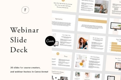
Premium Slide Deck Design Templates

What Next?
If you like the informational videos that we share here on Prettywebz, then make sure to subscribe to our newsletter to receive a notification every single time we send out a new video or a blog post. You can sign up in the footer of any page on the website.
Also join me on Youtube as well to check out the playlists I’ve set up for Photoshop, PowerPoint and other software you can use to design your online graphics.
Did you like this post? Share it with a friend or save it for later by pinning this image!