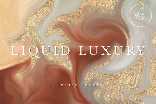

Dripping Gold Background Design Photoshop Tutorial
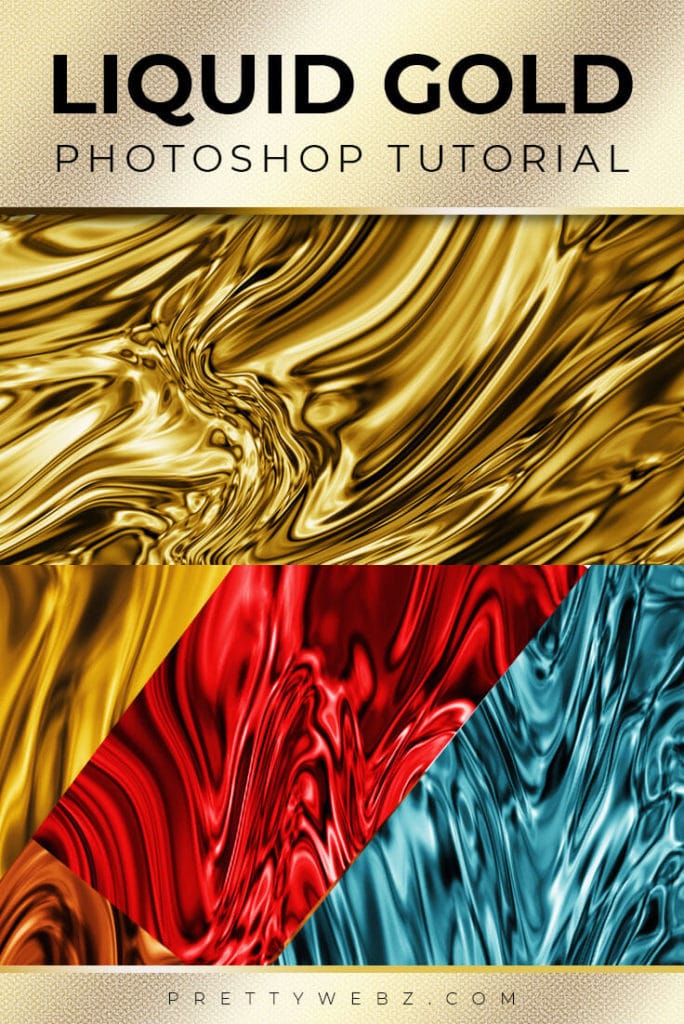
Learn how to make abstract backgrounds for typography, web design and graphic design base texture with PrettyWebz design tutorial videos. In this video, you will learn how to make this easy background design classic dripping gold texture.
This dripping gold background design works with so many different styles. Dripping gold is a classic style for phone wallpapers, screen savers and lock screens. You can also use this style for web design, social media graphics and print graphics.
What You Will Learn In This Tutorial
In this tutorial, we’re going to cover three things:
1. I’m going to show you where to find the best size dimensions for creating backgrounds, screen savers and lock screens for a variety of different digital devices in case you want to make a dripping gold background for phones and wallpapers for yourself or for sale.
2. Then I’m going to show you how to create the abstract dripping gold background design.
3. Finally, I’m going to show you how to make this design pop with adjustment layers targeting contrast, shadow, highlights and all the things that make gold and metallics so luxurious and gorgeous!
LEARN DESIGN TOOLS ONE STEP AT A TIME
Learn and master the most frustrating aspects of overwhelming programs like Photoshop and Illustrator in a fun and entertaining way with PrettyWebz design tutorials.
Tutorial projects like the ones we share here on the blog are meant to help you grasp the use of the most powerful aspects of design software one step at a time. In the process, you will build your design assets so that you can create a stunning marketing design for your business. So, don’t forget to sign up below in the footer to become part of the Prettywebz family and never miss another tutorial.
OTHER TUTORIALS IN THIS SERIES
In last week’s video, I showed you how to create a smoky abstract background and photography overlays with the flame filter. This is a great photography effect for accenting motion and stunning background for typography and photos as well.
In next week’s tutorial, I will show you how to make sparkler overlays to enhance your photography. Give your photos more impact and emotion with beautiful overlays that will enhance the mood you want to achieve.
RESOURCES USED IN THIS TUTORIAL:
You don’t need any outside resources to make this dripping gold background, it’s all Photoshop!
Other Posts You Might Like
Also join me on YouTube as well to check out the playlists I’ve set up for Photoshop, PowerPoint and other software you can use to design your online graphics.
Watch the video or read the transcript below. Also, check out other tutorials you might like from my Photoshop tutorial collection, branding, social media design, and design principles.
Start of Transcript
Today I’m going to show you how to make this dripping gold metal background. First I’m going to take you through where you can find all of the exact dimensions you’ll need to create wallpapers and lock screens for both Android and Apple devices.
From there we’re going to go straight into the tutorial and then finally I’m going to show you all of the adjustment layers that we use to create something that looks like what you’re looking at on the screen right [Depth and contrast for greater detail].
Now, this is a great abstract background that will work with pretty much anything. Typography, photos, websites whatever you need it for. so let’s go ahead and get started.
Wallpapers and Lock Screens Proper Dimension’s
I see this look a lot for iPhone backgrounds and those types of things so I wanted to give you a little tip as far as how you could save these in the proper dimensions for phone backgrounds and things like that.
I’m going to come up to file then new. Some times this area right here [very top of the new document dialogue box] gets overlooked a little bit. So we can come over here to mobile. It’s [Photoshop] going to give you all of these different sizes that are specific to types of phones or devices that you’re using.
Come in here [click “see more”] and it’s going to give you all of these different sizes. You have for Android, iPad, Retina displays… So if you’re interested in something like this [to use as] a background for phone or for wallpapers and things like that then definitely check this out as well.
Dripping Gold Background Pattern Examples
Before we start, I want to show you a few different patterns that I made for this dripping gold background. I did this project a few times before I decided to make a video on it. [I determined that] there’s really not any way that you can keep this a uniform look. Meaning it’s going to be different every single time you do it.
I wanted to show you what I did and where I started and what I’ve been working on so I’m going to turn these [other layers in the document] all off and just show you what I started with here in the beginning. These are some of the earlier ones and then I started getting into bunching some of this up here.
So really, I’m going to show you the technique but then you can go in and perfect the look you’re going for. Every single time you do this it’s going to be different. It’s [the design] going to have a different look, it’s always guaranteed to be custom.
Creating Gold Background Design
I just wanted to show you this quickly before we get started. Now I’m working here in a 1,000 pixel by 1500 pixel document. I’m going to go ahead and just add a new layer to what we’ve got going on here.
I have some adjustment layers that I was working with here. I did this one [demo of adjustment stack], this is like a darker moodier look here. I’m going to use something like what I’ve got going on here for deep-colored metallics.
So let’s go back in here [previously created adjustment layers]. I’m going to change the hue and saturation. These settings that I have looked really nice with these really rich jewel tone colors here. For the gold, I went for something a little bit lighter. Which is this group right here [ demo second stack of adjustment layers]. Because I’m going for a lighter yellow gold look for this one.
So anyhow let’s go ahead and get started. I’m going to add a new layer here and I’m going to turn these off. Actually, I’m going to put this [new layer] right under these two [groups of] adjustment layer settings. I’ll show you the settings that I have here in a little bit. I just want to go through how to create something like this first and then I’ll show you all of the different settings that I used.
The Base Gold Background Design
So, the first thing you want to do is make sure that you have your foreground background colors default to black and white. If you don’t you can just click on this little icon and that will do that for you.
From there, we’re going to come up to filter then render and clouds. From here we’ll go into filter then filter gallery. Inside of the filter gallery we’re going to go over to the sketch folder and inside of sketch we’re using Chrome.
The chrome settings for this are going to be, detail is zero and our smoothness we’re going to bring all the way up to ten. Click OK. You’re going to have something that looks like this [on screen demo].
Creating the Liquid Effect
When you get to this point you can come back up to filter and then liquify. Inside of the liquify panel, I’m going to zoom out just a little bit here so I can see the entire image. You’re using a document that’s similar to the size that I’m using right here, the 1000 by 150.
These are the settings that I’m using for my brush. I have my brush size at 609 the density at 0 the pressure 100 and I turned off pin edges for this one. I’m just going to come in here [liquify canvas] and smooth everything out a little bit. I’m going to go ahead and fast-forward through this but you’ll still be able to see the process that I’m going through.
Now for this, I’m working with this tool right here the forward warp tool but I have some areas that have kind of overdone here. I want to come in with this bloat tool and just work some of that out. Okay, once I get them more or less I still have a lot of areas here that I have overworked but that’s fine I’m just going to go ahead and with the tutorial. This will give you an idea of what I did.
Once I have all of that stuff out I can just come back in and smooth it out a little bit more [continued working smoothing the design in the liquify canvas] I think I’m going to leave this as it is. This is the design for this one [demo finished base gold background design].
Detail Work with Adjustment Layers
Brightness and Contrast
When I turn on all of those filters that I created for this, you can see it looks like dripping gold. I’m going to take you through the process of creating all of those filters. The very first one we’re going to add is a brightness and contrast layer. I’m going to leave my brightness at zero and bring my contrast up to 84. So it’s going to be pretty high contrast 83 is fine. Go ahead and leave that [the settings] there. This [Brightness and Contrast] is just to get into the detail of this and the lights and darks.
Curves Adjustments
Go back into the layers and I’m going to add another adjustment layer. This time we’re going to work with the curves. Here what I want to do is just bring up the brights [white] just a little bit and bring down the dark [blacks].
You’re going to have somewhat of an “s” curve here. Again we’re just trying to play on the light and dark of the chrome area here. We want this to look like shiny metal, liquid metal. So we’re just working on those lights and darks.
Vibrance Adjustments
So we’ll go back into our layers and I’m going to add another adjustment layer. This time we’ll work with vibrance. On the vibrance, I’m going to go ahead and leave the saturation alone. Actually, you know what will bring up the saturation to about 23 is fine. We’ll bring our vibrance up, bring it to 48.
So we’re getting something that looks more like Chrome and less like a silky texture or some like that. Even though you could adjust these a little bit and create a nice silky texture. What we’re going for is liquid metal or gold.
Hue and Saturation Adjustment
Okay, so we’re going to add another adjustment layer. This is a hue and saturation layer. This is going to be the last adjustment that we’re going to make. We’re trying to make gold so we’re going to bring this [hue] down.
Also, very important for this make sure that colorize is checked so that we can actually see the color because this is a chrome shiny texture. We’re going to bring this [hue] to about 34. I think I’ll bring up my saturation just a touch. We’ll bring our saturation up to 58 and we’ll bring our lightness up just a touch as well. Just to about nine or ten, this is for the lighter yellow gold.
Of course, if you want a darker gold background, you can make adjustments here to your saturation and lightness.
Premium Products You Might Like