How to Make Rose Gold Font Effects Super Easy
Rose Gold Font Effects In PowerPoint and Word
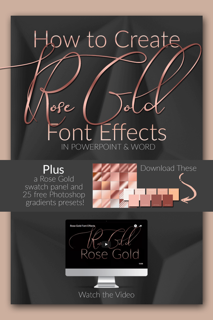
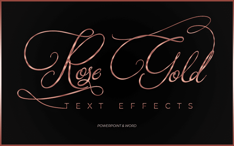
Rose gold font effects are super easy to create using the perfect rose gold color codes and some shadow and lighting effects. The best part is that all of this can be accomplished using programs like Word and PowerPoint. In the first part of this post, I will show you how to use the gradient feature in the text editor inside of PowerPoint.
Scroll down a little further to find the complete tutorial for creating rose gold text effects in Word as well. I also have instructions written out for doing this in Word as well.
This is very similar to the PowerPoint tutorial but the second video goes step by step inside of Microsoft Word which some people will find helpful. Plus this video has a little design twist I think you might like.
In my last blog post, I shared with you some rose gold image overlays. I thought I would keep the rose gold theme going in this post to get a great text effect without Photoshop. You don’t need fancy software to create luxurious and expensive looking lettering.
Gold Color codes Update
I’ve added another tutorial to my Youtube channel on this very same topic, this time using Photoshop. The new tutorial will walk you step by step through creating gold gradients in Photoshop with an added bonus. I will show you how to install the gradient files in your copy of Photoshop.
In this post, I give you a set of rose gold gradients for Photoshop because Photoshop is the program I use most and I wanted to make my personal color gradients available to you if you use Photoshop as well as other programs.
This new gold gradient tutorial uses the same concept I’ve used in this video below for PowerPoint and Word. I’ve also added some gold gradients for Photoshop as well as some gold color code swatches you can use in the same way we’ve used the rose gold color codes in the video below. That means you can use PowerPoint or Photoshop to get the same results even faster!
Make sure to check out that post to grab this new freebie. I’m letting you know about it here since I do have a rose gold photoshop gradients freebie in this post and it only makes sense to show you how to use them in Photoshop. Okay, back to rose gold!
The Basics Of Rose Gold Font Effects Using Rose Gold Color Codes
The video above goes through the step by step process of creating rose gold font effects but here are a few pointers for using this design method to get the most out of your design. These guidelines are not set in stone but I’ve found that the rose gold look is much more realistic if I follow specific guidelines when designing.
Take these suggestions with a grain of salt and experiment with the general method to get the look that’s right for you. Every font is different and the gradients will look different so it’s important to work with the stops and rose gold color codes that work best for your specific font.
Design Tips
- The most important thing to remember when creating a rose gold text gradient or any other metallic gradient within your letters is that metallics catch light in some areas and shadows in others. This distribution of light means you’ll have a balance between the actual color and then a variation of lighter and darker sections to account for light and shadow found in the natural reflections in metal.
- If you’re using two colors you will bring in a light color variation of the color that you want to use and a much darker variation of that same color so that the gradient mix finds a balance somewhere in the middle.
- Don’t use black or white solid colors for your highlights and shadows this will look unrealistic. Make sure you stick to variations of the same color when creating metal letters.
- For thin fonts, you can use much more dramatic stops and color variations in your rose gold color codes. If you want a dramatic, almost shimmering effect stick to thin fonts or fonts that have a lot of texture to them like handwritten and Marker fonts for the best results.
- If you’re using a thick, bold font stick to simple transitions in the rose gold color code. Using too many colors with dramatic changes in light may look unrealistic with thick or heavy lettering.
Rose Gold Font Effects, The Rose Gold Color Code “Tool”
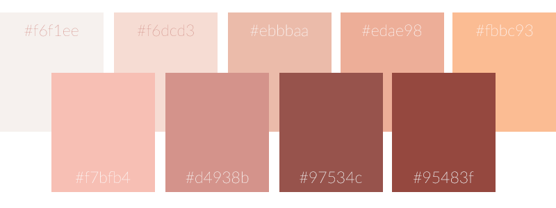
To show you how to create a rose gold font effect using gradients, I’ve got a simple tool. I put together some rose gold color codes & a palette. This simple graphic is made up of the perfect rose gold color codes and features amazing blushes and pinks that all work well together. These rose gold color codes have highlight tones and darker tones. Most importantly, the color variations will lend well to a rose gold text effect.
What color code is Rose Gold?
Rose gold is a mixture of at least two different color pink tones that create highlights and shadows that mimic a metallic effect. To make a rose gold RGB color you will need to make color “recipes” then use these recipes to create gradients in Canva, PowerPoint, Word, Photoshop or any other program that supports this function. This is an example of a rose gold color code combination to create the rose gold color.
Rose Gold color code: Highlight: F6DCD# Base: #D4938B Shadow: #97534c
The swatch below contains all of the rose gold color code swatches to create a rose gold effect. Using a swatch like this one will make things go much quicker and give you the flexibility to play with variations in color as well. I made it big enough so you can copy it from here but if you want the truest color PNG format, you can download it here.
How to use the Rose Cold Color Code Swatch – Choosing Color Variations
If you’ll notice in the color swatch above, the top layer has a much lighter color profile while the bottom has some dark and some bright colors. You can get light mixes by just using the top pallet or select colors from both pallets. All of these colors are a variation of rose gold so they will all work well together. Provided you keep in mind the central principle in creating these gradients. Your text needs highlights and shadows.
The colors you choose from these color codes will depend on the rose gold text effect you want to achieve. You can use a light pink as your shadow color and still get a fabulous rose gold text effect. The shades of pink you choose don’t matter as much as the mixture of light and dark and make sure you have enough contrast between the lightest color and the darkest color within your gradient.
How to use this Rose Gold Color Code Swatch in Microsoft PowerPoint or Word
Import your rose gold color code swatch image into PowerPoint or Word. The process is the same in both software.
At the top of the screen in the main menu, choose <<<insert>>> then click <<<image>>>
Once you have the image inside the document, select your eyedropper tool when your mouse cursor turns into the eyedropper tool icon use it to pick up color from your swatch by clicking on your desired color with your mouse and add it to your gradients.
Using the Rose Gold Color Code Swatch to Increase Design Productivity
I tend to think of the rose gold color code swatch as a digital paint pan. Just sample your color and the program will save it to your recently used colors making your work super easy and convenient. When you’re done designing your font, delete the swatch image. The rose gold color code swatches will make designing rose gold lettering so much easier and speed up your workflow considerably.
You don’t have to put in codes individually, look up RGB values and go back and forth having to remember all of them. With these swatches, you dip your virtual brush into your palette, and you’re set. Besides, even copying and pasting RGB codes is too much work, there are too many steps.
All of this is too complicated and causing you to waste valuable time that you can use more effectively elsewhere in your business. You’re better off just putting your pallet on the screen and then deleting it when you’re done.
Specific Instructions for Microsoft Word
Using Microsoft Word for creating special fonts most people think they can only get from design programs like Photoshop is actually very possible. In fact, Word is a much better option than using online programs like Canva because you’ve already paid for it. You can use the fonts you’ve already paid for and it works offline too. If you follow the video above on how to create this effect in PowerPoint, this is basically the same process with some slight variations.
Below is a step by step to getting to the text editing area inside of Word. From there you can adjust stops and colors just as you would in PowerPoint. Microsoft does not have drastically different design tools between their programs, so this will be very similar in most of the Microsoft Office Suite.
Accessing Text Effects and Gradients in Word
Type out the text you want to use for your design and select it (highlight the word or words)
Then go to the “text color” drop-down
select <<<gradient>>>
Then <<<more gradients>>>
and <<<gradient fill>>>
The color stoppers will come up just as in Powerpoint. From this point, you can make adjustments to the positions of the sliders, add or remove colors and set up gradient direction just as you would in PowerPoint.
To use the color panel
In the color stopper drop down menu choose <<<More Colors>>>
In the pop-up menu choose the eyedropper icon to select colors from your screen.
About Using Color Gradients for Text in Canva
I’ve been asked this question enough that I decided to add it here. So if you were wondering if this effect could be done in Canva, the answer is yes and no. Let me explain. As far as I know, you cannot create metallic gradients in Canva. Canva does give you the ability to create gradients. If you search the word “gradient” inside of the Canva app, you will find them.
You may be able to manipulate the gradient stops in Canva to create a rose gold gradient. Even if you can make custom gradients in Canva there is still the matter of getting the gradient inside the text. The problem here is you would have to mask your text with the gradient.
I know Canva has lettering that holds pictures, with these predefined letters you could create a rose gold font effect. You could add your gradient as an image but you can’t do it with your own text as in PowerPoint and Word. I hope this helps if this was a question you might have had.
The best fonts for a rose gold text effect
I mentioned this briefly above but I want to give you a little more context on font selection and how to get the best rose gold text effect for your preferred font.
A complicated rose gold text effect with multiple color stops on the text effects editor look best with thin lettering. This is because the gold tones look more realistic this way. You’ll get lots of shimmer without overwhelming your design. In my experience, I would try to stick to thin san serifs with simple lines, tall thin fonts and script fonts when using more complicated gradients.
If you’re using lettering with thick bold type, then use more simple two or three stop gradients. You want a simple transition from light to dark. Using multiple abrupt stops in your gradient color will give you a harsh reflection that will look unrealistic. Thick fonts can have drastic changes in light and shadow but for the most part, a subtle change with a thick, bold font will be easier on the eyes and better for your design. Of course, you should experiment to see what works best for you.
A dark background color makes a rose gold font pop in a design. However, you can use this type of gradient with a light background, and it will still look fabulous. Just keep in mind, if you’re looking for a more realistic rose gold font effect, try to use fonts that are more subtle in stroke width and use a darker background.
Fonts Used In the Video Tutorials
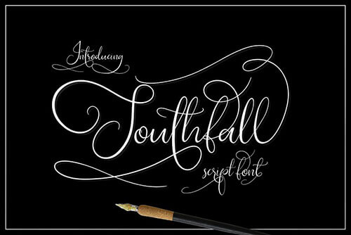
If you’re curious about the fonts used in the video tutorial I’ve added some links here to the exact fonts I used. The script fonts used are lovely fonts by a very talented designer. Both fonts come with tons of ligatures, extra swashes and all the good stuff you get with a premium font.
The fonts used in the demo videos are:
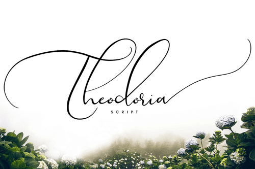
Theodoria Script font designed by Creativeqube Design
Southfall (Slant) also designed by Creativeqube Design
Lato (Thin) From Google Fonts
Rose Gold Font Color Code Mixes
Below are two variations on the rose gold font effect using RGB and HEX rose gold color codes. Both of these are very simple two color gradients. I encourage you to experiment with these color variations.
Use just two colors, to begin. With only two colors you can create exciting gradients by moving the stops for variation. You can always get fancy later with three, four and even five colors rose gold font effects, but I think you’ll find that simple color choices work very well in achieving the best results.
Rose Gold Color Code Variation One
The first variation of rose gold I want to show you does have five color stops but we’re only using two colors. This variation of light and dark will give your text a shimmering effect.
Colors used for this variation are:
97534c RGB: R 151 G 83 B 76
d4938b RGB: R 212 G 147 B 139
Rose Gold Color Code Variation Two
This variation has only three color stops and uses two colors to get a nice smooth metallic effect.
Colors used for this variation are:
95483f RGB: R 149 G 72 B 63
f7bfb4 RGB: R 247 G 191 B 180
Downloads and Resources
If you’re using PowerPoint or Word to create your rose gold font effects, you’re in luck. I’ve got a rose gold color code panel that will make your life so much easier. Download the PNG swatch panel to get the truest color possible. You can get the panel here.
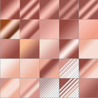
If you do have a copy of Photoshop, I’ve got something for you too. I created a set of 25 rose gold gradients that you can upload to Photoshop and use as presets to save you a lot of time.

Using Photoshop to Create Gradients
Remember, the design concept is the same in any text editor, use shadow and light along with the correct color and you will achieve the rose gold font effect you’re looking for. If you know how to use Photoshop layer blending modes, you can add these gradients in and use them to flip through several gradient variations in seconds to get the right look for your text.
The ability to upload patterns, styles, contours, and gradients are among the most significant benefits of working with Photoshop. I try to work outside of Photoshop as much as possible for everything I do on the blog. I know that new bloggers and business owners are already on a huge learning curve. You’re dealing with marketing, the online world and of course, the everyday tasks of running a business. You’ve got your hands full as it is.
Is Photoshop Right for You?
I know that learning a design tool as robust as Photoshop will only add to the frustration. Purchasing Photoshop and learning the software takes a lot of time and effort. If you’re new to business odds are you don’t have time to spare.
However, if you do have a copy of Photoshop or would like to learn how to use Photoshop for your business it is a great investment of time up front that will serve you for years to come. If you’re somewhat familiar with this amazing program, that’s great! You’re already ahead of the game. You should take advantage of using these gradient presets to save a considerable amount of time and watch any or all of the tutorials below to help you practice and learn a little more about Photoshop. You can still upload the color swatch panel into your Photoshop PSD file if you want to get more specific variations of color as well.
Other Posts You Might Like
In the long run, when you feel like you have all the other aspects of your business under control. I highly recommend dipping your toes in the water with Photoshop. Even if you have a designer, navigating Photoshop for quick projects will give you the best quality output.
What’s Next?
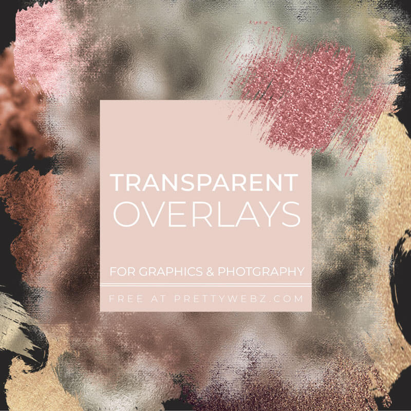
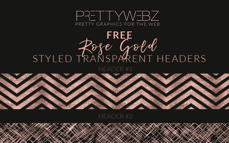
If you like rose gold font effects and beautiful feminine design I’ve got a treat for you. I know you will love some of our other rose gold graphics available for free in the shop. The newest is our Image overlay kit and we’ve also got some sweet transparent rose gold headers, sequin social media icons and themed digital papers and many other free and premium graphics visit the PrettyWebz shop to check them out.
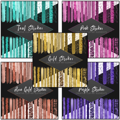
I’ve also got a free sample pack of my metallic brush strokes kits, so definitely take advantage of that freebie as well if you like using image overlays.
Want to learn more about designing in PowerPoint?
Check out my post on creating mood boards in PowerPoint and creating a brand book (brand style sheet) in PowerPoint. PowerPoint isn’t all about branding though, learn how to create vector graphics from fonts and use them as frames and templates here.
Get more free graphics by signing up for the PrettyWebz newsletter and never miss out on a freebie again!
Every resource we offer on the blog and in the shop is put together in a convenient package for you and deliver to your inbox every single month!
More Posts on this Topic
Subscribe to get more on Youtube!
Last but not least, for those of you who didn’t know I’m now doing tutorials on Youtube. I would love it if you subscribe to my new Youtube channel to get notified of all of my tutorials on marketing design and templates.
If you’re a business owner who does business online these tutorials will be a great resource to you. You can expect tutorials on Photoshop, PowerPoint, and many other tools designed to make your life as a business owner much easier.
I’ll also be sharing tutorials on how to use planning products and design assets available in my shop. Sometimes you don’t know you need something until you know what it can do. That’s my goal with these product tutorials. I want to show you the time-saving potential of using templates and graphics assets in your business. So please check me out on Youtube
If you liked this post and want to share it with your friends on Pinterest, pin this Image. You would make my day if you did!
