

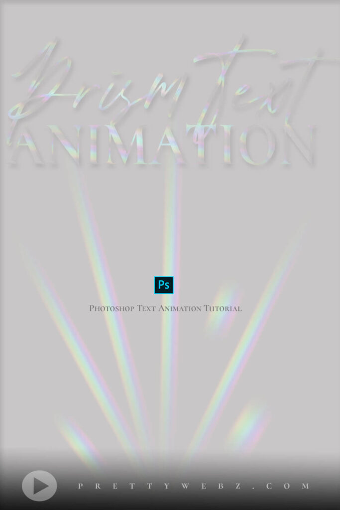
Prism Text Animation
In this Prism text animation Photoshop tutorial, I’ll show you how to create a light refraction-style prism text animation. This calming text animation Photoshop tutorial is replicating a glass or crystal prism with rainbow light flowing through it. The slight bevel of the text gives a delicate illusion of prismatic light.
LEARN DESIGN TOOLS ONE STEP AT A TIME
Learn and master the most frustrating aspects of overwhelming programs like Photoshop and Illustrator in a fun and entertaining way with PrettyWebz design tutorials.
Tutorial projects, like the ones we share here on the blog, are meant to help you grasp the use of the most powerful aspects of design software one step at a time. In the process, you will build your design assets. Before you know it, you will have created a good working knowledge of Adobe design software and a nice asset library for your business.
Don’t forget to sign up below in the footer to become part of the Prettywebz family and never miss another tutorial.
Also join me on YouTube as well to check out the playlists I’ve set up for Photoshop, PowerPoint and other software you can use to help build your online presence.
Resources for This Tutorial
Click for a direct download of the resources mentioned in the video. Resources are for reference, or in personal or client work. Tools can be used for creating your own resources but cannot be repackaged and sold on their own. Thank you!
____________________
More Posts on this Topic
Prism Text Animation VIDEO TUTORIAL
Prism Text Animation Video Transcript
Hey there Mercedes here from prettywebz.com and today I have a text animation Photoshop tutorial for you.
this is going to be a light refraction text effect. We’re replicating a crystal lettering that has this light beam trapped inside of it.
So, let’s go ahead and get started. We’re going to start with a new file.
Setting up the Document
I’m going to come up here to file, new, and we’re going to be working with a basic 1920×1080 resolution 72, RGB, 8-bit.
Go ahead and click create.
I’m going to unlock the background and I’m going to be using this background color. So it is #afafaf or rgb 175 all the way through.
So, I’m going to go ahead and click ok, command and delete, control and backspace or control and delete on a pc to fill that with that gray color.
This is going to be the fill for the text, so whatever you put here is going to be the color that you’re going to see inside of your text.
Creating the Light Refractions
Now from here what we’re going to do is create the light refraction. So the little rainbow light that you’re going to see going through your text.
Let’s go ahead and create that quickly. I’m going to come here to the shape tool and I’m going to choose the ellipse.
I’m just going to click on the screen, we’re going to leave it at 100 pixels. So, it’ll be 100 wide by 100 height.
Go ahead and keep from center checked and click ok. Now your properties might come up here for you.
If they do not you can just come up here. I’m going to go ahead and click on fill, right there.
You’ll see you have these options here, we’re going to choose this one right here, this is the gradient fill from your Photoshop defaults.
We’re going to be using this one right here, it’s called Spectrum.
Loading Default Gradients
If you don’t see these here and you’re working in a Photoshop 2020 or later you’ll have to come up here to Window and then choose the gradients from here.
That’s going to bring them up right here. You can come over here to the hamburger menu and then just choose legacy gradients and those will come up for you.
So, I’m going to get back in here. I’m going to choose that Spectrum gradient.
Gradient Settings
I’m going to leave it at linear, my angle is 90 degrees, and my scale is 100 percent. Now I’m going to right-click and rasterize this layer.
And just to get a sense of what these are going to look like when they’re inside of the lettering, I am going to change the blend mode to screen for that ellipse layer.
We’ll have to change it again here in a minute but, you know, just to give us an idea.
Filter Settings
So I’m going to start with this and we’re going to come up here to the top and choose filter, blur, motion blur.
We’re going to blur it 10 degrees and our distance is 150, go ahead and click ok. Come back up here to filter.
We’re going to choose that same one again, blur, motion blur.
This time we’re going to change the angle to 15 and our distance is going to be 150. So that’s not going to change. We’ll go ahead and click ok.
The reason I did that is just to give it a smoother look out here. If you like that sharper look you don’t have to do that second step.
Okay so, I’m going to press command and the letter j to duplicate that. I’m going to turn this one off because I’m going to use it here in a minute.
Positioning the Light Rays
So this one that we have selected, I’m just going to stretch that out maybe I’ll bring it in a little bit.
I want it a little bit thinner and longer and what we’re doing is we’re creating these rays.
They’re going to shoot out of a center point right here, so this is going to be the first one.
Anchoring the Light Position
So what we’re going to do is make some copies of this, command j. We’re going to do that three times.
So, we’ll have four copies of this and I’m going to leave them all in this position right here.
I want to move them from a specific spot right here, what I’m going to do is use this anchor right here and just drag it over.
If you don’t see this anchor just make sure that “show transform controls” is selected and then just move that anchor over here before you start to rotate it.
We’re going to come over here and just kind of hover and when you see that double arrow there you can just move that as far up as you need to.
Return, to set that.
Now we’re going to come back here to the next one. We’re going to do the same thing, just make sure that that anchor is right there.
What we’re trying to do here is make sure that our light source is coming from the same spot for all of these.
So, I’m just going to move this down as much as I can and I’m going to move on to the next one.
Again, I’m going to change my anchor there to the side and then move this and you can, you know, drag these out even more.
Varying Size and shape of Light Fragments
They don’t all have to look exactly the same. I’ll go ahead and leave this one where it’s at and drag it out.
Make it a little bit bigger and you can add more or less of these. Grab the first one hold the shift key, grab the last one.
Command and the letter g ctrl and the letter g to make a group from those. I’m going to right click and duplicate this group.
I’m going to call this right and click ok and the second one, I’m also going to rename this left.
Just so we know where everything’s supposed to be.
Positioning the Right Side Light Fragments
Now I’m going to grab this right group, come up here and go to edit, transform, and we’re going to flip it vertically.
We’re also going to flip it horizontally. So we’re going to come back up here, edit, transform, and flip horizontally.
So, we’re just making kind of the opposite of what we had before. Now we’re just moving these over.
Okay, now I’m going to turn these off and I’m going to turn this little one on or the visibility of these on.
Positioning the Small Light Fragments
I’m going to duplicate this a few times, so command and the letter j. So, four copies of that, and I’m going to turn on the left and kind of start positioning these here.
So, I just want these to kind of look like broken light you can make them shorter
I’m going to put one over here, rotate it and this can be really random.
Just as long as your light source is coming from the same direction, the fragments do not have to be uniform.
They’re going to look better if they’re not, so just kind of be a little random with this.
So, I’m going to grab all of those and I’m going to put those in the left. Turn that off.
I’m going to turn on the right, and we’re going to use these last three over here on this side so just move it around.
Okay so I’m going to grab these three and put them in the right folder and now I have everything set up.
I have the right folder selected, command and the letter e, that’s going to merge that together.
You can see how I just took it back to normal. We’ll have to change it to screen here in a minute.
But we’re going to go to the left, command the letter e, to merge that as well and we’re going to just change these back to screen.
All right, I’m going to grab that right one and I’m going to start it up here somewhere.
So up here in the corner, and then I’ll start the left one down here in this corner. I’m going to leave those there for now.
The Prism Text Animation Font & Text Settings
Now what I’m going to do is work on the text effect so I’m going to come in here and to my text tool and just click on that.
I’m going to click somewhere on the canvas and just type, Light. Okay for the text, I am using a font called Cormorant SC.
You can grab this on Google Fonts and I’m using it in bold. The text size for this one just happened to be 724.53.
All I did was drag it out to make it big enough to fit the canvas.
It’ll be somewhere around this, if you’re using the same size of canvas that I’m using. And then everything else is fine.
I have a black color in here, it really doesn’t matter because we’re only using this to create a selection.
So, you’ll have to position the text exactly where you’re going to want it on your canvas.
The Text Mask
Now I’m going to go ahead and click on layer 0, right click and duplicate this layer and this is going to be the text mask.
I’m going to click ok. So, we’re going to drag that above the text. I’m going to come back here to the text layer.
Command or Ctrl while you hover over this letter t right here. You’re going to see a little hand, a little pointing hand and a square.
Go ahead and click once and you’ll see that you’ve made a selection of that text. Now you’re going to come up here to the text mask.
So just hit delete on your keyboard to cut that out, command + d or ctrl + d to deselect that selection.
We don’t need this text anymore, I’m just going to go ahead and put it here at the bottom and turn it off.
We have this text mask and we have these two layers here at the bottom. These are our light refractions.
You can see how they’re being hidden by that text mask that we just created. So what I’m going to do now is create that crystal.
Just that see-through glass effect that we’re going to be using, so I’m going to click here on the text mask.
Prism Text Animation Layer Styles
Just double-click right here on the far right-hand side, we’re going to bring up these layer styles and we’re going to use first an inner shadow.
The blend mode is multiply, the color we’re using is that same color, RGB 175, hex code afafaf.
My opacity here is 36 percent, distance is 12, size is 15.
Click right here on drop shadow, the higher the opacity the more distinct you’re going to get of a bevel right here.
So, I’m going to bring mine down to about 10 because I really just want it to be very subtle.
I want it to be more about the light than the glass, so our angle here is -27, the distance is 14 and the size is 2.
Go ahead and click ok.
Prism Text Animation Timeline Settings
Now we’re going to come in and create the animation. So, if you don’t have this down here you’re going to have to come up here to window, then choose timeline and then that will come up for you down here.
There are two options, we are going to be using create video timeline for ours so go ahead and click on that and that’s going to bring this up for you.
This is the timeline for our animation that we’re going to be creating.
I’m going to bring this in a little bit so that we can see what’s going on here.
I’m actually going to drag this out so you can see this is five seconds right now, make it 10 seconds.
I want the light to move a little bit slower so I’m going to end it there and then I’ll drag these out in the same way.
Let me bring this up here so you can see that everything here is going to correspond with everything that we have in our layers panel here.
When I have this selected, it’s going to select it down here. If I select the left it’ll also select the left down there.
Right Settings
So we’re going to be working on the right first. I’m going to bring this down so we have a good view of everything.
Let’s turn this off. I’m going to turn the left off and then I’m going to come in here and click on this little arrow.
That’s going to reveal all of these options right here for us. We’re going to be working with position for this video.
So, I’m going to click on that little time clock right there and that’s going to create a key, or a first position for us.
Once I have that set I’m going to come over to the timeline and drag it all the way to the end.
And then I’m going to bring this down to the bottom here.
So, I’m going to let it end right there and you can see it automatically added the second key for me.
I’m going to hit return to accept that change and then you can see when I press play, all it’s doing is bringing that down.
Left Settings
I’m going to take this back to the beginning and now I’m going to turn on the left, click on it, click on that little arrow right there.
Click on position, just like we did before to create that first key.
Drag this all the way to the end and then position our refraction all the way up here to the top.
Return to accept that, and we’re just going to see what this looks like. We may need to make adjustments but we’re going to start with this.
So I’m going to go ahead and turn on the text mask and then press play and this is what it’s looking like so far.
It looks okay, it’s a little busy and actually the light is a little too much so what we’re going to do is take down the opacity to 50 on both of these.
The right and the left, so we’ll just come in here and just change those really quickly. I’m going to bring this back up here to the beginning.
I’m going to turn that text mask off and I’m actually just going to make this bigger so I’m just going to stretch it out.
The same thing with this one, just stretch it to the end. Turn this back on and let’s see what we’ve got here.
So, working with the light is really just about finessing where you want the light to hit while it’s inside of the lettering.
You can work with that to get exactly what you want.
Closing
I hope you enjoyed this video, if you did make sure to like and share it.
And if you want to see more videos like this one make sure to subscribe so you don’t miss another video.
And as always, visit prettywebz.com for more design resources and tutorials.
Until next time thanks for watching