

10 point Success guide for DIY blog designers
Calling all DIY blog designers! If you’re thinking about designing a blog or a website, but you don’t have any design experience you might be hurting your blog. You have great content but that’s just one part of why people keep coming back. Are you taking advantage of everything you can do to keep readers on your pages? That’s where good blog design comes in. The good news is you don’t have to be a designer to make a great first impression you just have to follow a few design rules.
There are some things you can do that will drive your readers away, and some things that you can do that will keep them coming back for more. In the end, it’s all about your audience, this is the golden rule of web and blog design, and I’ll share ten more in this post.
Back in the day designing and launching a website on your own without any technical knowledge was unheard of for the most part. Now that all of that is behind us, the free and low-cost options are almost overwhelming.
These days we as entrepreneurs have more opportunity than ever before to bring our businesses online. We have the power and resources to deliver what we have to offer to the masses. From free website builders and templates to relatively cheap web hosting, there’s no excuse not to bring your business online. Except one. Your website and blog design are making a bad first impression.
Is your beautiful blog making a bad first impression?
You may have a beautiful design but sluggish loading time and progressive (but confusing) bells and whistles that came with that fantastic WordPress template are turning your potential audience away in droves.
Think about it, would you stay on a site if you couldn’t figure out how to navigate? I’m willing to bet you’re not going to waste your time. So why would anyone else spend time waiting for your splash screen video to load? They won’t.
Just because you have the option to add floating buttons and paragraphs that flash across the screen as you scroll doesn’t mean you should use it all. Still, these cool effects are almost too good to pass up, trust me I’ve been a victim of all the flash myself.
In the end, I know my audience isn’t coming to my site to be amused by my crazy parallax effects and animations. I can have these things, and I do use them sparingly.
I know you’re not a designer, you’re an entrepreneur, and you don’t have time to read books on design theory and principles, you just want it done already. I get it, so let’s keep it short and sweet. Follow these ten guidelines when you set up your blog, and you just might come out of it with a DIY blog design any designer would be proud to call their own.
Top 10 Must follow Guidelines for DIY Blog Designers
Fonts
1. Don’t Use Too Many Fonts
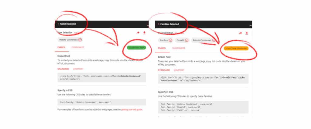
Limit your fonts to no more than two so that you don’t slow down your site with font loading time and also for enhanced readability for your audience. Check out this resource guide to font pairing for more help.
2. Font Size
Keep your font size between 16 and 25 points depending on the font used. A font that’s too small will hurt readability. If the font is too big, it will also hurt readability.
3. Typographic Hierarchy
Sub-headings should be more significant than body text, and the main heading should be more substantial still. How much bigger should a heading be than a sub-heading, a tag-line, body text or sub-script? To find out you have to determine the typographic scale you’re going to use throughout your project.
How to do it
If you use the body text size as your base, other text should be multiplied by a specific ratio to get the proper scale for the hierarchy of your text. For example, if your body text is 18px then this is your baseline if you decide that you are going to use 150% of body text or 1.5 as your ratio, then the next size up will be 18×1.5 or 27px
27×1.5 is 41px (rounded) 41×1.5 is 61px and so o. Your sub-text will be 1.5 less than 18 which is 12px
Resource: Try this modular scale calculator for help with this.
Side Note: Search engines use hierarchy too but not in the same way you or I use it. For SEO, heading 1, 2 and three are not used to show visual hierarchy but rather to understand the topic being discussed. For SEO you should set up your blog posts like this:
- Heading 1 (H1) The blog post title (do not add another H1 tag within the post & make sure to use keywords here)
- Heading 2 (H2) The main heading in the post (make sure to use keywords here)
The following tags can be configured for aesthetics using other ways to define hierarchy with weight, color, and size.
- Heading 3 (H3) subheadings (given less priority by the search engines)
- Heading 4 (H4) subheadings (given less priority by the search engines)
- Heading 5 (H5) sub-script (given less priority by the search engines)
- Heading 6 (H6) super-script (given less priority by the search engines)
Paragraphs
4. Use Proper Line Height
Line height should be 1.5 or 150% of body text size at a minimum. Don’t cram your text together, give it some room to breathe. In most cases, it should be equal to the body text, so if the body text is 16 points and your using a baseline ratio of 1.5, then the line height will be spacing is (16×1.5) 24 points.
Tip: You should be able to fit a sideways ‘h’ (same font and point size) between the lines without it hitting the tops of d/b/t’s (ascenders) or the bottoms of p/q/y’s (descanter’s).
Line Height for Mobile
If you’re wondering how your spacing will convert on mobile screens, you can do that by using em scaling instead of set points. Your base font size is equal to 1em. If you’re using a line ratio of 1.5, then your line height will be 27 pt. (18×1.5) T0his works in the same way it did when you calculated hierarchy of your font sizes.
5. Keep Paragraphs Short
Paragraphs should be two to three sentences long. Large blocks of text are overwhelming. The reader needs to have a sense that they’re progressing through the text not drowning in it. Creating shorter paragraphs may not be what you learned in English class, but it will help your audience get through the reading with a lot less effort.
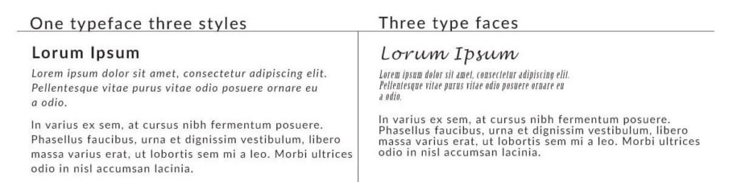
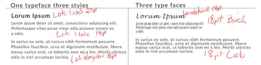
6. Keep Paragraph Line Width Concise
Don’t make the eye strain, the paragraph should not extend more than 45 to 75 characters, and this depends on the font. Wider fonts will use fewer characters per line while narrow characters will fit more characters per line. See the image above for an example of the distinct difference in space taken from font to font.

7. Be Consistent With Case Use in Headings
- All upper case letters can slow down reading so try not to use it for long titles and headings. All caps is best when used for one, two or three words. For example, you can use all caps on buttons and menus.
- Sentence Case is where only the First word of the heading is capitalized
- Title case is where you capitalize every word in the title
Images & Visuals:
8. Stay consistent with your color Pallet
Stay consistent with your imagery, colors, and typography. A brand has to be recognizable on and off the website. Imagery, color, and typography are your brand’s style. You wouldn’t go to work at McDonald’s wearing a Burger King uniform or sport the other team’s colors at the big game. You’re going to confuse people. You don’t want that.
Personality aside, your look says volumes about what you stand for and how your business comes across to the world. Check out our guide to selecting the perfect colors for your brand for more help with color selection.
You can change your image but make sure you stick with one or the other rather than flipping back and forth. Your readers should always know what to expect from you. Your imagery, color palette, and typography are your dress code.
Straying too far from your original color palette can become confusing for your site visitors. People like consistency, be dependable and consistent in every way.
Tip#1: Black, white and gray are neutral colors. These colors can be used when no others are appropriate for backgrounds, dividing sections and text.
Tip#2: Do not use pure black on the web, it’s hard on the eye and creates stark contrast which has an unpleasant effect on the reader.
9. When it Comes to Images, Size is Important
Make sure you have proper image size for your project. Big images will be shrunk down to fit but will still have the big load time and decrease the speed of your site. Graphics need to be compressed to load faster.
Taking images directly from the camera and uploading them to your site means you will have large format images that are 3000 to 7000 pixels weighing down your site. Even a large hero image loaded on a desktop does not have to be this big. The size of a hero image is between 1800 and 2000 pixels.
10. Use the Proper File Type
- Use jpeg when there is no text overlay on your image if you don’t have crisp and defined lines to consider.
- Use PNG for images with text overlay and objects in the photo that needs super crisp line definition. A PNG has a more significant file size, so make this decision carefully.
- If a super crisp definition is not as important as loading time, opt for the loading time.
- If the beautiful crisp text in your message is most important to you, then go with PNG.
If you’re one of the growing group of DIY blog designers, you know have an edge on everyone else so congratulations! If you liked this post and would like to know when new posts are released I urge you to sign up for the newsletter to get notifications on new topics on the blog, video tutorials and freebies we publish every week!

