

Image Composition Best Practices for Your Blog Posts
Image composition on your blog posts is simple. The more images, the better, right? Scattering images throughout your text is an excellent way to keep people reading don’t you think? Using pretty pictures with bright colors is the way to go, don’t you agree?
You may think all of these are good practice and it seems logical. It might even look great on your blog, but if you’re not paying attention to your blogs image composition as it relates to your text, it could be hurting your readership.
Image Composition Guidelines from an Advertising Legend

David Ogilvy is arguably the most famous marketer in history. Ogilvy created and followed specific principles of advertising. In turn, he was such a success, thousands of marketers emulate his techniques to this day.
Apply these principles of image composition to your blog post image. If you do, you can expect your images to increase your readership.
Okay, Ogilvy never wrote or said anything about image composition on your blog posts. What he said in his book about advertising was, “The wrong advertising can reduce the sale of a product.”
Wait a minute. We’re talking about blogs here. What do newspaper ads and selling products have to do with my blog? I just want more people to read my posts.
Your Blog as a Marketing Tool
Like it or not, if you sell anything your blog is a marketing tool. Yes, it’s a way to communicate with your customers and give them support in your area of expertise. Maybe even an outlet to teach them a thing or two but all of that is part of marketing.
Therefore, the amazing blogger that you are I know you created your blog with a desire to share your passion with the world, but you are also a marketer.
If you ignore these principles of image placement, your images will reduce your readership.
This statement is a conclusion a lot of marketers have made based on research performed by Ogilvy on image composition in newspaper ads.
Although Ogilvy did not perform research for the web, you should consider your blog a form of marketing because the same strategies used to keep people reading a long-form advertisement such as the type that made Ogilvy so famous are the same strategies that will keep people reading your blog post.
You know you’ve done it. Read all about content creation and soaked up all the how to write the best blog post ever, blog posts so in essence what you’re doing is looking for tactics and a strategy to keep people reading.
Hello marketer!
Is this Ogilvy stuff right for overall readership and user experience on your blog as well?
There are many rules and principles for content marketing based on Ogilvy’s work. All of it is worth looking into if you want to sell online. Even if what you’re selling is your blog post. In our examples, we are focused more on retaining readership (this is our sell) than actual products.
Image composition Print vs. Online
Reading is reading, whether it’s online, in a newspaper or a book. We read from left to right (in the west) and from top to bottom. This practice is subconscious behavior and ingrained in us from a very young (and impressionable) age.
If you think the mechanics of how you read have changed since kindergarten then the most famous marketer in history is probably wrong but, what if he’s not?
Principles for image composition based on Ogilvy’s research
These “rules” are considered best practice by many. However, like Ogilvy says, “I hate rules” so nothing is absolute. These principles are merely a place to start. A baseline to start testing what works for you.
-
Feature Image placement
- An image intends to draw attention to your subject and bring them into your writing. Make sure your feature image introduces your topic rather than interrupting it.
- You can do this by placing your feature images above your headline.
- Don’t cut off reading by placing an image after the headline and then expect people not feel the interruption. Even if it’s subconsciously, they will lose their flow, and that’s not good.
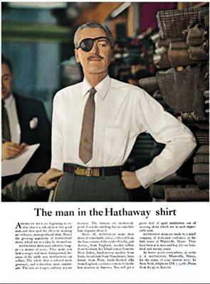
- Ogilvy found that people read headlines placed below an image 10% more often than those above the feature image.
-
Use captions
- Just like with headlines, you want to use images to enhance the reading not stop it all together.
- According to the Ogilvy research, people read captions more than they read the actual text! So use it!
- Explain the photo, explain a concept, or describe something that relates to your body copy. Explain how this photo enhances what you have to say in the article.
-
Body Image Placement
- Keeping with the theme of readability, make sure your images are placed between thoughts (paragraphs) and not directly cutting off a fundamental concept.
- You don’t want to interrupt reading with an image but instead, have the image enhance or foretell what they will learn next.
-
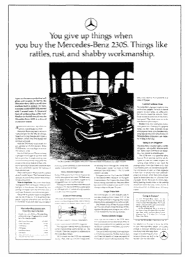
Align your images to the right of the text
Here’s another example from Ogilvy using a large hero image followed by the headline and the text. - Even more on readability – Keep your pictures on the right-hand side of the passage or above it rather than on the left. Images to the left of text force the eye to the middle of the page and then all the way back to the left creating eye fatigue. One exception to this is using small images at the beginning that does not intrude on the entire paragraphs. Drop caps styles are also unobtrusive and provide a cue that a new thought is beginning.
- Remember these principles are based on research on reading based on print ads so take it for what it’s worth. I added this one specifically because it makes sense both on and off screen.
- We read from left to right, in the West at least, so why add an interruption to your message? I used to think that scattering images all over my blog posts would create interest and keep people reading my post. Why they would continue reading when I keep interrupting them with quotes and stock images, I have no idea.
-
Use relatable images
- Use images that make sense to the context of your copy.
- Before you start a new thought
- When you’re telling a story or emphasizing a point
- Pay close attention to the relevancy of your images. I have always been a big fan of image quotes. I love the emotional impact of quotes and the foretelling effect that they have. Quotes are also personal and most importantly (at least for me) not stock. With that said, sometimes quotes don’t make sense. Especially in a tutorial or resource post. Putting a quote in a blog post like this would throw you off as a reader. You’re expecting step by step action, not musings and contemplation.
- There are two functions for images within a blog post:
- Enhance the story (emotional, quotes, people, metaphor, etc.)
- Cement the point (demonstration, comparison)
- If you have trouble relating the image to your text with a caption, it might not belong there.
- Use images that make sense to the context of your copy.
Further Reading on Image Placement in Your Copy
These are only a few of the principles of advertising introduced by David Ogilvy. Most do not relate to images specifically, but they are very informative and thought-provoking. Test these ideas in your writing.
The Ogilvy Website
Learning strategies used by (arguably) the best marketer in history, can make you a better writer, increase blog readership and retention and make you a more knowledgeable blogger. You may decide to monetize your blog at some point. In this case knowing, the tried and true marketing principles is an excellent start.
If you want more information on the Ogilvy research, you can find that here.
David Ogilvy’s Book
To grab a copy of David Ogilvy’s bestselling book “Ogilvy on Advertising,” you can find it on Amazon. At the very least check out the cover. Note how big the text is in comparison to the image and how the Title works around the picture on the cover. If it isn’t broke don’t fix it right.
Image Research
If you want to learn more about image placement and how it will affect how people are interacting with your blog posts I recommend this study on picture superiority. This paper is a great piece that explores how important images are to teaching and retention of information.
Though not directly related to image placement it will give you some good insight into types of images work best to help readers not only get through all the text but also reinforce what they’ve read. It is in the Jstor records library but if you sign in you can read it online for free! If you’re a college student, you can probably access and download this through your school.
If you want someone to remember what you’ve taught them, give them a visual reference. This is interesting stuff.
What Else?
If you found this post helpful be on the lookout for more posts and videos featuring design principles for bloggers and online business owners. You can also sign up for our newsletter to get notifications whenever a new video, post or freebies are made available on the site. We share new resources every week!
You can also visit us on social media. We’d love to hear from you. Drop a link to your latest project on our Facebook page, it would make my day to see what you’re working on!
