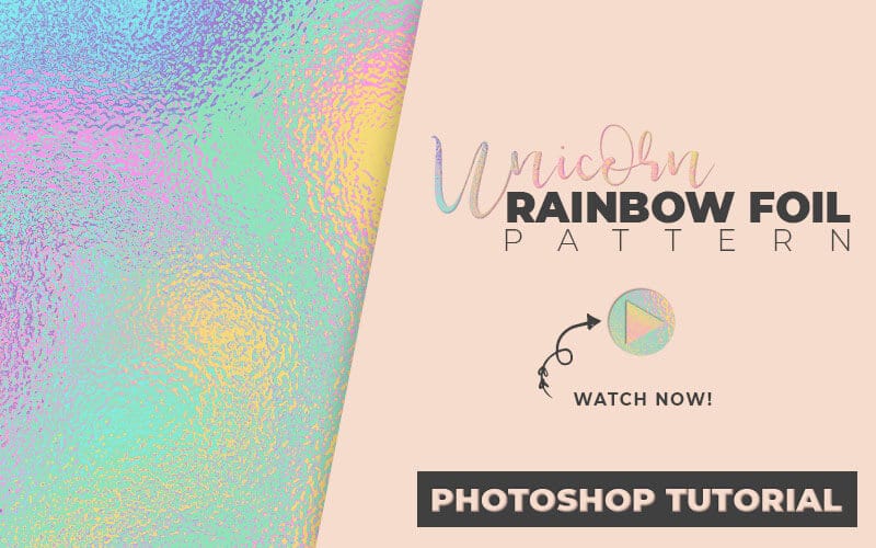
How to Make a Unicorn Rainbow Texture
Kids designs, birthdays, celebrations or just because, this foil texture is a fun and playful way to add some sparkle to your next design. Learn how to make whimsical unicorn rainbow foils in Photoshop.
This tutorial is super easy to follow and learn how to make color palettes with Adobe Color Themes, get thousands of premade color palettes and add this fun rainbow foil texture to typography or save as a texture inside of Photoshop.
Learn Design Tools One Step at a Time
PrettyWebz tutorial can help you learn and master the most frustrating aspects of overwhelming programs like Photoshop and Illustrator in a fun and entertaining way.
Tutorial projects like the ones we share here on the blog are meant to help you grasp the use of the most powerful aspects of design software one step at a time. In the process, you will build your design assets so that you can create stunning marketing design for your business. So don’t forget to sign up below in the footer to become part of the Prettywebz family and never miss another tutorial.
Also join me on Youtube as well to check out the playlists I’ve set up for Photoshop, PowerPoint and other software you can use to design your online graphics.
Other Posts You Might Like
Watch the video or read the transcript below. Also, check out other tutorials you might like all about pattern and texture making inside of Photoshop. From whimsical and cute to glamour and high impact textures and patterns.
Video Transcript
Today I’m going to show you how to make a shimmering unicorn texture inside a Photoshop. I’m also going to show you how to use Adobe color themes to choose colors and create swatches to work from. From there we’re going to get right into those Photoshop filters, so let’s go ahead and get started.
Applying the Unicorn Rainbow Foil Texture in a Design
I just want to show you quickly what this will look like when we put it inside of text. Then we’ll go ahead and get started with the tutorial. I’m going to add a pattern overlay and we’ll bring this up to 100% then click OK.
You can see let, me zoom in here, what that looks like inside of text.
Designing the Rainbow Foil Texture
Document Settings
We’re going to be starting with 1500 by 1500-pixel, 72 resolution, RGB on a white background. If you want something for print, set a higher resolution and change your color mode to CMYK and then just click create.
Color Blocks
Now from here, we’re going to go ahead and go to our shape tool. We’re going to choose the rectangle tool and then drag it across the screen. Okay, so this is our first shape. Hit the letter V on the keyboard to get these anchors here and then press option/alt on the keyboard.
You’re going to see that black and white double arrow. Then you just have to drag down. We’re going to drag this down several times until we cover the entire canvas with it. They don’t have to be aligned perfectly.
Okay, we’ve got six [shapes] total right here. Grab the first layer up here and I’m holding down the shift key on my keyboard and I’m going to grab this last layer. Click on this anchor point and just bring it up. I want all of my shapes on the canvas.
Using the Swatch Panel and Adobe Color Themes
I have my swatch panel open. You can get to that from window and then swatches. It kind of looks something like that [demo on video] when it’s over here on this side.
I’m going to leave that [swatch panel] open and come up to window extensions and go to Adobe color themes. Adobe Color Themes is a great tool for creating your own color pellets. You can create your own here. Choose your primary color and it’s going to give you other colors that go well with it. You can decide how you want those colors chosen. These are all color rules that you can choose from [demo in video] for creating your color pellets.
For us we’re going to go ahead and use the explore tab, you can also save your themes right here [demo in video]. We’re going to use this explore tab and these are [premade] color palettes that other people have created in the past. Go through these and choose a color palette that you like. [Alternatively] you can search for something.
I’m going to look for pastel colors. I’ll scroll through and see what I find. Let me type in “unicorn.” Okay, so I went ahead and typed in “unicorn pastel” and I came up with this right here [demo in video] which I like. I’ll go ahead and leave this yellow but I’m going to choose this color palette right here.
Saving swatches from Adobe Color Themes
So, I’m not going to keep any of these colors. Because I’m just giving you an example so I’m not going to need these after I finish up here. I just wanted to show you quickly how you could save these. Just in case you want to use them for a bigger project or use them later on again.
If you come over here [demo in video] they have these little three dots. This is the color palette that we’re going to use. If we want to keep this color palette and save it to our swatches we can do that right here. You can either edit the theme itself, add to your favorites, add to your swatches, or view it online.
We want to add it to our swatches it’s going to add it down here [demo in video].
I’m going to click on that [the three dots] and you can see right here [demo in video] how it’s added those colors to the swatches. Once you have those in your swatches palette you can save the palette permanently.
Saving Swatches with the Preset Manager
Come up to edit and then go to presets then preset manager. In your drop-down menu right here click on swatch. You can actually choose those colors. I don’t even know where they end or begin to be honest because they selected it twice here but let’s just say it starts here [demo in video].
Click on the first one you want to save. Hold down the shift key click on the last one and you have all those colors selected. Then I can just come over here and click Save set. Name it [the color palette] anything I want. Save it [the color palette] to my computer or wherever I want to keep it and it’ll [Photoshop] save that color palette for me.
A Word on CC Libraries
You can also save it in your CC Libraries. If you’re comfortable with CC Libraries and you’re sure you’re always going to have access to the internet to get to that then go ahead and save it there.
I typically don’t save anything to CC Libraries, that’s just a personal preference. A lot of people love CC Libraries and won’t do without it. This is all based on preference.
Selecting Colors with the Eye Dropper
With my little eyedropper, I can just click on that color and it’s going to add it right here [demo in video]. These are my recently used colors up here. So, I’m going to choose that one, this one, this blue color, this purple and then this lighter pink [demo in video]. I’ll go ahead and leave one of these yellow.
Once I have those colors I can come over here to my shapes. I’m going to hit the letter “U” on my keyboard to bring up the color for that shape. Now, I have all of those colors right here in my recently used colors. [Demo in video] I’m going to turn that one pink, we’ll go to the next one. We’ll make this one purple, go to the next one. Make that blue…
Preparing the Shapes for Filters
We have all of our shapes in place and the colors that we want them to be. So, I’m going to go ahead and grab this first one again [shapes in the layers panel] shift on my keyboard and
grab the last one. I’m going to right-click and choose rasterize layers.
Now I’m going to come over to my keyboard and press command E or ctrl E and just turn that into one layer. I’ve got one layer right here I’m going to make a copy just in case I don’t like the way the filters are applied. This [applying filters] is a little unpredictable. So, you can go ahead and make a copy, you don’t have to. But it’ll just save you a lot of time so you don’t have to start over from scratch.
So, we’re going to start with this [flattened color layer]. I’m going to come up to filter then liquify. I’m going to bring that down [zoom out]. Now I’m working here with this forward warp tool [demo in video] and I’m using a very big brush.
The size for this [brush] is 1100. I can bring that [brush size] down to about 500. Density is a hundred [percent] pressure is a hundred [percent]. I have pin edges checked.
If you are working with an older version of Photoshop, I believe before CC 2014 or somewhere around there, you don’t have pin edges. You’ll just have to be extra careful not to leave any transparent areas in your design. For those of you who do have pin edges go ahead and check that off.
Then we’re just going to come in here [filter window] and start moving things around. Okay, so I’m going to go ahead and leave that as it is.
Pin Edges for Older Versions of Photoshop
Before I go [leave the liquify filter window] I want to show you this pin edges thing. So, when I don’t have pin edges you see how I get these transparent areas down here [demo in video]. Then all I would have to do if I didn’t have it was to bring that down [move brush toward the edges].
I just wanted to show you that that’s the whole idea with the pin edges. I’ve gotten comments about that tool in the past so I just wanted to clarify that. Click OK.
From here I’m going to go back into filter, then blur and I’m going to choose Gaussian blur. I’m going to blur it to about eight. Click OK. You want a nice uniform blur. I don’t want to see any of the harsh edges in the design.
I’m going to come back up to filter then filter gallery. This time we’re using the distort [filter] and we’re using this glass filter. This is my favorite filter lately. I’ve been using it a lot for my tutorials. I’m going to back up a little bit [zoom out] so you can see what that looks like.
This is the shimmer that we’re getting. We’re going to leave our smoothness at 2 and I’m going to take that distortion up to about 18.
Changing Liquify Settings After Filter Preview
Now, if you like this yellow and you want to get that in there as well you can click cancel [without saving]. Then come back to filter then liquify and bring up some of that yellow [drag with brush]. You’re not completely stuck with what you have once you get to that final filter. I’m going to click OK. That’s going to be way too much yellow now. I just wanted to show you that [adjusting liquify filter].
We’ll go back into filter then filter gallery. We’re working here once again in distort and glass. I have my distortion set to 15. I have my smoothness at 2. My texture is frosted and I’ve scaled it up to 180. You can take it up to 200. I’m going to click okay.
Now you’ve got that shimmery unicorn texture. We can come up to edit then define pattern and save it as whatever you want.

