Font Combinations for Web Design, Branding & Social Media
What Does Branding Your Font Combinations for Web & Social Mean?
Branding your font combinations for web and social is a way of communicating to your audience who you are and what you stand for. All of this is very important to how your customers feel about you, how they relate to you and, ultimately if they will buy from you. Branding is important, that’s why you have to take every aspect of branding into serious consideration, including your choice of font combinations.
The fonts you use will evoke strong emotions for your ideal avatar. More than that, the fonts you choose to represent your business also need to go well together to create a subtle yet definitive message about who you are as a company.
What do the fonts you use say about your business?
Just like color, fonts evoke emotions and create assumptions in the mind of your customers. Colors and typography are a big part of your overall branding. These two pillars of design are like clothing to your business. This post will give you all the basics of font classes, the emotions that they evoke and how to pair them together to get the perfect mix of style and feeling to represent your brand.
Before we get into the specific points of finding your way around typography and how to brand font combinations for web and social media, it’s a good idea to know why this is important. Bare with me or skip over the next section but, I do want to go over (very quickly) why learning how to pair fonts and colors are so crucial to your overall brand design.
Everything You Already Know About Social Interaction and Why It’s Vital to Your Branding
How You Dress Determines The People You will Attract
We all know that how you dress sends a message about who you are. Your style attracts specific people to you. It makes sense that if you want to draw a particular type of person, you have to be what they find attractive.
How do you want to dress your business? What message do you want to send out to the world with not only the colors but also the fonts you choose to represent your company?
You Need To Focus on an Ideal Customer/Reader/Client
You’ve heard a million times by now that you don’t need to attract everyone, you have to draw the ideal person. You need to dress your business to impress your perfect customer. What do they like? What fonts and colors speak to that person?
Choosing font combinations for web and social media is part of creating a clean and consistent style for your brand. Going too far with typography, just as with color will generate inconsistency and potential mistrust.
Design Should be Simple
When it comes to design, you’ve heard that you should keep your graphics simple. Never use more than three fonts and make sure your typography goes well together. When you learn how to pair fonts, these are the basics. That’s all well and good but, how do you know what font goes with what? What are the clues that you’ve gone too far?
Now we’re getting to the point.

How Many Fonts?
Google fonts will give you pairings for the fonts on that website but what about fonts you purchase or download somewhere else? How do you know if you’re doing it right when it comes to font pairing outside of Google fonts?
Typography can get complicated. There is a never-ending sea of fonts and typefaces and more created every day. With so much to choose from, there’s no way to know for sure what works and what doesn’t.
Trust Your Gut
You have this excellent script font and that fantastic serif font, but you want to throw another font in the mix. It all comes down to what you like. What you think looks good together and if the combination makes you happy. Creating font combinations for web design & branding is not a science, it’s an art.
When Your Gut Just Isn’t Enough
Okay, we all think we have great style and make the best decisions when it comes to the design of anything from our clothes to our homes. Still, the neighbor looks at us sideways every time we walk out the door in our 80’s sweatpants.
The point is, sometimes what we think looks okay, doesn’t look okay. For that reason, I put together a list of essential font pairing tips to help you choose and pair your fonts wisely. I’ve also got a font pairing chart that will help you out as well. Your graphics will look perfect, and you didn’t even have to try all that hard.
Classifications
Let me explain the categories. First, understand that there are many classifications of fonts and typefaces and what I’m giving you is just the basics. I’m sure I’ve left a whole lot out of this list. If you come across something I didn’t cover in this post, then you’re going to have to go with your gut about where it belongs. Don’t worry though. There’s not much that falls outside of these categories.
Serif
A serif font is traditional, classic and well established. Serif fonts are often used for traditional fashion brands, men’s fashion, law offices and business with a serious nature to them. When you think of serif fonts you should think of refinement, someone or something that is distinguished, established, serious, reliable and old fashioned.
Fonts In This Category
- Old Style
- Transitional
- Neoclassical
- Slab
- Glyphic

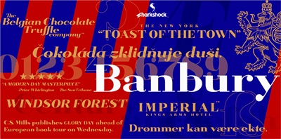
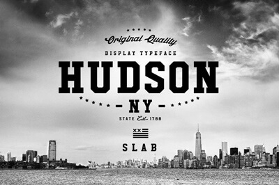
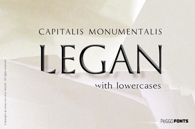
How to Pair Fonts
Serif pairs well with the following: sans serif, script, decorative
Sans Serif
Sans Serif fonts are clean with no serifs. Sleek, simplified, minimalistic are all adjectives I would use to describe these fonts. Even though there are plenty of Sans Serifs that are thick and bold, they all share the sleek and modern attributes achieved by the absence of the serifs.
For example, some fashion designers want to project an image of being on the cutting edge. Other more established fashion houses have been around for generations. The latter want to project an image of refinement and tradition. Which font class would you assign to which designer?
Fonts In This Category
- Grotesque
- Humanistic
- Geometric
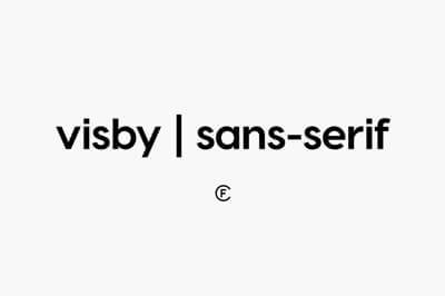
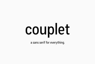
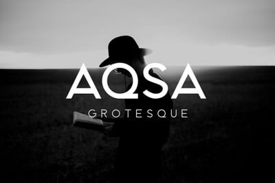
How to Pair Fonts
Sans serif pairs well with: serif, script, decorative
Script Type Styles
Without a doubt, my favorite category of typography is the script category. Script fonts have such a wide range of emotion. From elegant and romantic, to fun and bubbly. I have found myself at opposite ends of the spectrum when it comes to script fonts, and I love them all! Well, depending on my mood.
Style, creativity, playfulness, they all live here within this category.
Fonts In This Category
- Formal
- Hand Written
- Calligraphic
- Blackletter & Lombardic
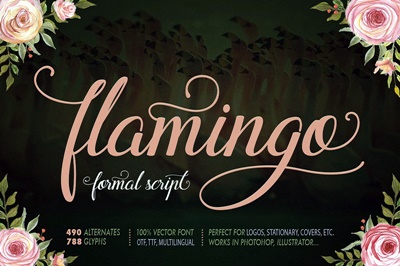
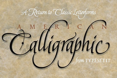
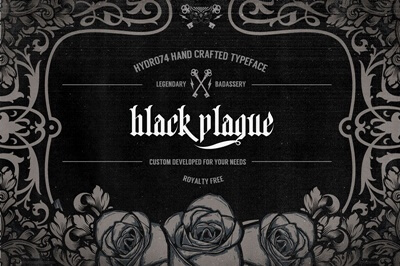
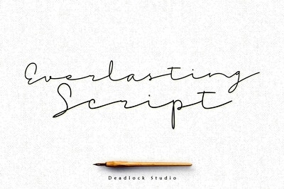
How to Pair Fonts
Script fonts pair well with Serif or Sans Serif fonts
Decorative/Display
Decorative and display fonts are used interchangeably in my vocabulary. I’m sure someone can point out the differences between the two and I might accept that but probably not.
You typically use decorative and display fonts for larger format design, bold headings, art pieces, and posters. These fonts have artistic qualities to them, that’s what sets them apart.
It’s difficult to define what puts a font in this category rather than one of the others. After all, they do have serifs, or they don’t. Some decorative fonts are similar to a script, but there’s more to them than just being serif, sans or script.
These fonts command attention. Decorative fonts are unique, expressive, whimsical and fun. Display fonts can also be bold and dynamic or dark and moody. The one thing that keeps decorative fonts out of any other category is the artistic nature that they hold.
If you’re creating font combinations for web design and social posts using display fonts, just know that they can’t be used for body type, ever. Use these for the main title but don’t take these too far. Less is always more when it comes to decorative fonts.
Fonts In This Category
- Grunge
- Graffiti
- Themed
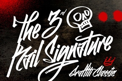
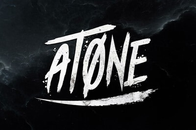
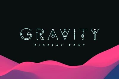
Pair with Serif or Sans Serif
Still Not sure what to do?
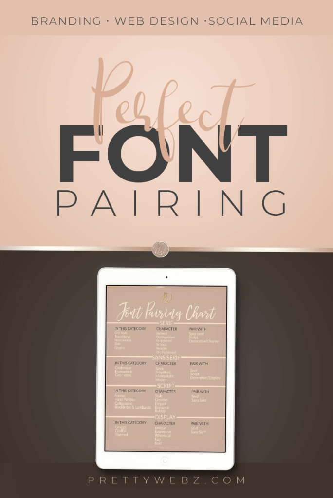
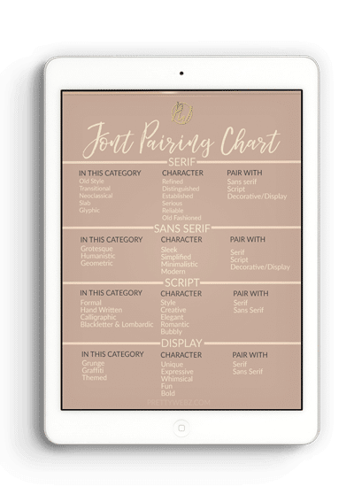
Don’t worry I have a font pairing chart I put together for you. Creating font combinations for web design & branding can be overwhelming if you don’t know where to start. I made this simple font pairing chart to help you decide how to pair fonts smoothly with no stress. You can download it here, just click on the Ipad.
There are so many beautiful fonts out there, choosing font combinations for web design, social media and branding can be overwhelming. Get inspired by font combinations from the pros. I’ll walk you through some amazing resources for inspiration on perfect font combinations, font pairing, font composition in the video below.
Now you know how to pair them up!
Finding High-Quality Fonts
Some fonts are much higher quality than others, especially if you’re using it for print work and large format. My favorite place to find attractive, high-quality font resources is the Creative Market. I could get lost in everything they offer. Take advantage of this amazing resource if you’re serious about branding your business and making it as unique as possible. Remember, the majority of bloggers and even online business owners are using free fonts because, well, they’re free. If you really want to stand above the crowd, invest in premium fonts, you won’t regret it.
If your business is very new and premium fonts aren’t in the budget yet, don’t worry there are tons of great quality free fonts all over the web. My go-to place is always Google fonts for accessible, commercial use fonts for web design and social media. Because I know that Google fonts are free for commercial use, that’s one less thing I have to worry about. If you get your fonts any other place, you also have to hunt down the license and hope the font is good quality. You’ll find out when you print something or create a large format promotional image that doesn’t look as crisp as it should. Personally, I choose to use my time elsewhere and go with Google fonts.
Okay, now that I’ve sung Google fonts praises, it’s important to note that there are some amazing free commercial use fonts from pro designers if you’re willing to search for them. Searching for fonts can be a time-consuming process, If you have the time then it’s worth the hunt. Since you’re reading this blog, you’re in luck because I’ve already done that for you! Check out my post featuring a beautiful collection of fifty free, commercial use fonts from pro designers.
If you’re choosing a font for your business or business purposes, make sure you’re always using commercial use fonts, and you keep a copy of the license.
If you want to learn more about typography Typedecon is a great resource.
What’s Next?
Make sure to subscribe to the PrettyWebz email list to get notified of new products, blog posts, and videos and get exclusive access to my list only free graphics and templates. You will get direct links to all of the free downloads on the site and in the shop in a convenient clickable pdf every single month. Don’t wait! Sign up today so that you don’t miss the next free email only offer from PrettyWebz. These assets are only sent out once, if you miss it, it’s gone forever.
Also join me on Youtube as well to check out the playlists I’ve set up for branding, marketing, Photoshop, PowerPoint and other software you can use to design your online graphics.
Did you like this post? Save it for later or share it with a friend, pin this image!
